The Summer Of Fan Art

(Obligatory sentence about needing to update this more)

Diary,
I’m doing two posts tonight! It’s technically still night because it’s 11:56pm. Semantics.

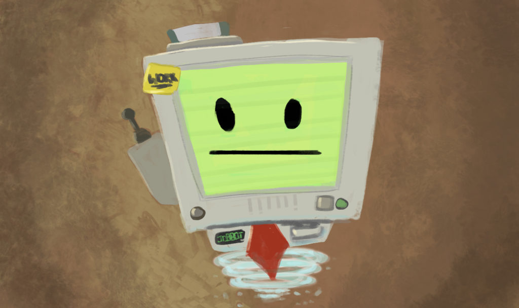
First is a quick post (this one) to let you know what I’ve been up to all summer. Nothing ‘too’ exciting but there’s some new art and the like. The last post talked about my VR painting in Elite Dangerous. Well I did it again in Job Simulator because… just because.

That’s just too much fun. I have/had lofty goals of doing this in a bunch of VR games but I’ve been so busy the last few months it hasn’t worked out. Here’s the finished masterpiece.

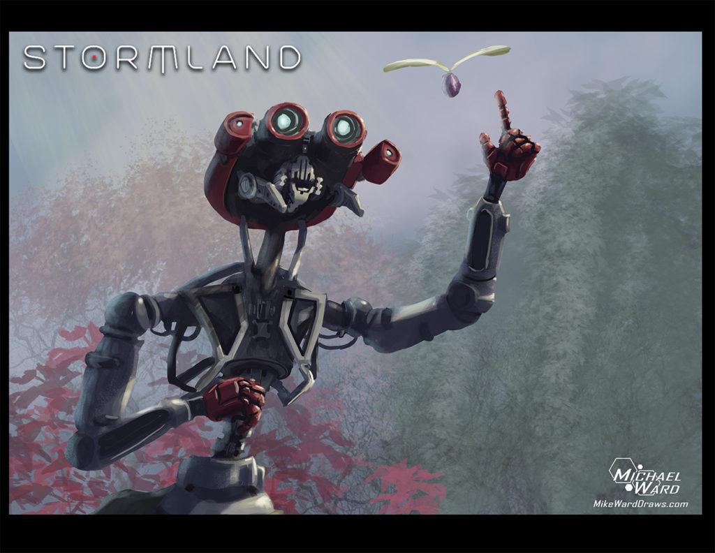
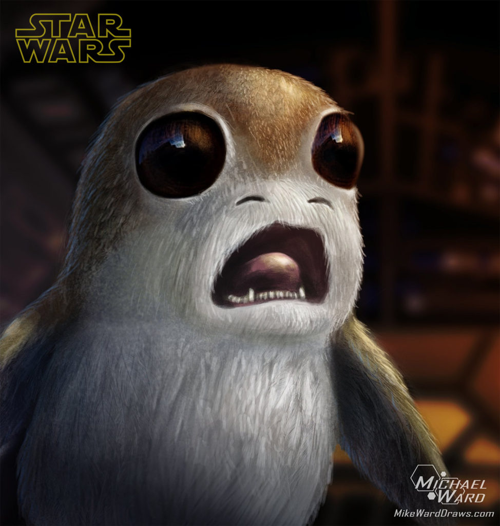
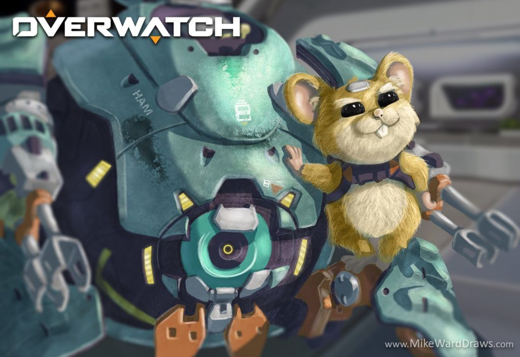
Yeah I’m great. I’ve actually ‘mostly’ only done fan-art this last little while. I’ll explain why in a second but here’s the 5 latest pieces:

Star Wars Porg Fan Art

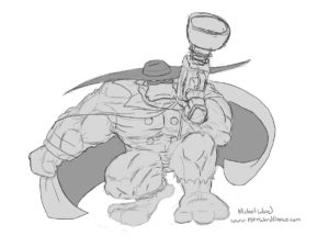
hammond wrecking ball fanart

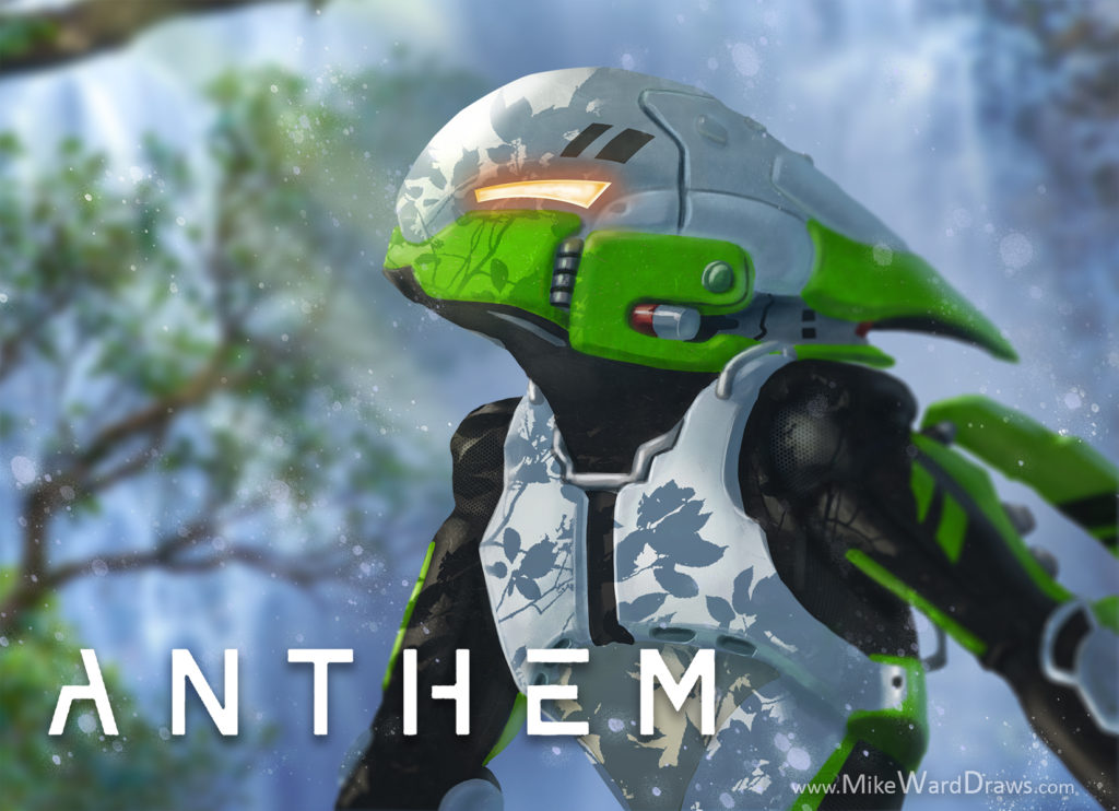
Anthem Interceptor Javelin Fan Art

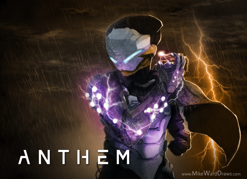
Anthem Storm Javelin Fan Art

I’m really enjoying doing fan-art. The main reason I started was actually just to develop my painting skills faster. If I only paint original characters I end up spending hours in the planning and sketching stage which isn’t the part I wanted to work on. By doing characters that are already designed I can skip right to rendering. I think it’s paying off. These aren’t necessarily the sharpest paintings but the longest one probably only took 5 hours (the Overwatch Hammond Wrecking Ball up there) which is light speed compared to the start of 2018.

I used mostly the default photoshop brushes mostly out of laziness and so they aren’t as sharp as I’d like. The stuff I painted last year was way more crisp so I need to find a happy medium between the two that doesn’t take quite so long. I’ll get there.

I made animated gifs of the development for all of these but this post is already picture-heavy so I won’t put them here. You can find them on my facebook, twitter and instagram if you are so inclined.

Last year I started learning 3D modeling in ZBrush. I stopped after a while for various reasons but decided it was important I started up again. This time I started with Maya though because I don’t just want to sculpt. I want to learn the whole gambit including retypology, UVs, bump maps, etc. I followed a bunch of slick tutorials on the youtube and ended up making this (click the below picture if it’s not changing):
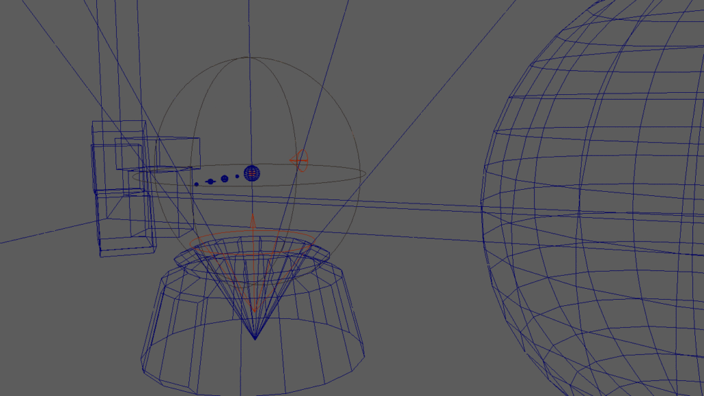
I left this one as a gif. I’m hecka proud of myself for rendering this scene in 3D but ultimately the final piece is not ‘that’ exciting. Seeing various steps and frames makes it slightly more interesting even if ultimately it’s very rudimentary. Mostly basic shapes like rectangles and spheres. I really like how the bump map on the earth made the mountains and textures stick out even though it’s just a smooth ball. Technology is so cool.

BUT ultimately I will be taking another break from 3D for a bit but I’ll get into that in another post.

Nearly done. I first wanted to show off the crazy thing that happened on twitter. I posted an old-ish drawing I did for fun of D.Vas mech from Overwatch and it blew up. Easily my most popular drawing to date.
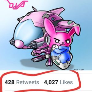
It really boosted my follower count. AND MY EGO! I know it’ll be a while before anything blows up like that again but that’s ok. It was fun while it lasted. And now finally I’ll just end this post with an art-dump of a bunch of stuff I made recently that doesn’t deserve it’s own post. It ranges from doodles to cartoons to photoedits and whatever. Mostly nonsense. You’re welcome.

And there’s tons of other sketches and doodles and photos but they are even dumber than these. You really should follow me on the twitters to see everything. That place is my jam.

Love Michael


Character Design Colour – City WIP

Really short post today Diary,

Remember in my last post I mentioned that I have to colour a cityscape for this weeks assignment as well? I don’t think I’m going to have it done. Truthfully the entire assignment was due last wednesday but that class had to be postponed until this upcoming tuesday. I decided that with the extra few days I would start over and do this assignment right!

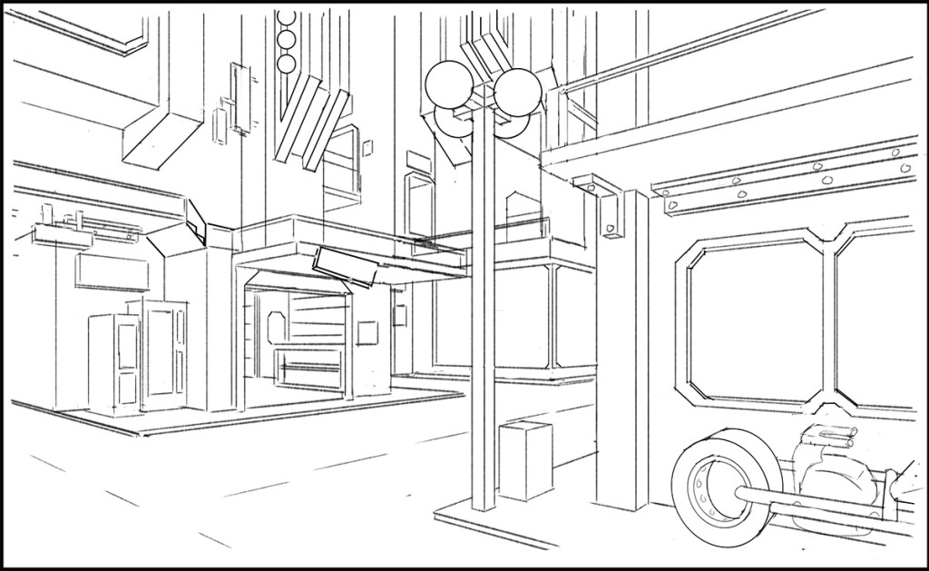
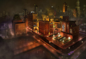
But it’s not going right! Nope. Not at all. Well ok it’s not bad. Here’s the Work-In-Progress.

crimecitysketchAs you can see it’s way more detail than my previous Medieval Suburbs had. It’s kind of a jumble of lines right now but when I add the value it’ll all start to be much more clear. I hope.

The assignment is due in about 23 hours so I’m going to get to bed and start painting in the morning. Wish me luck!

Love Michael


Violin Guy Critique

Diary,

I got my mark on the assignment. 80%! Arg. Will I never get 110%?? My coach will be so mad.

Once again I’ve screwed up a whole bunch of fundamental stuff. For instance his stupid flat face:
violincrit1Actually the flat nose was deliberate. You see his girlfriend is a shovel. And before he left for work one day she kissed him on the nose… -NO IT’S NOT SUPPOSED TO BE FLAT! Was I blind when I handed this in? Here’s some grade A polygoning of how it should look.

violincrit2See how it even covers the far eye? Yeah. And speaking of the eyes. They are flat too. And I don’t mean flat in the ‘Kristen Stewart flat dead expressionless eyes’ way

kristen-stewart-50-shades-weird__oPt

but the ‘his eyes are literally flat discs covered in face meat’ way. Eyes are balls. Face balls. Balls of the face. Covered in face meat.

violincrit3And there’s my new Halloween avatar.

Adrian did like my chains though. That’s pretty cool since I didn’t look up a single guide on drawing them. And they didn’t take all that long either. I think I’ll make a quick tutorial for drawing chains, by golly.

violincrit4He said I did good on the pose though which is awesome since I spent a whole evening just coming up with that. There was other stuff wrong but instead I’ll tell you what was wrong with the other picture. (I’ll never run out of things that are wrong!)

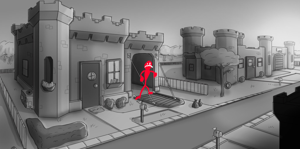
castlecrit1

For the most part he seemed to like it. At least the concept of it. I didn’t make it really clear that it’s modern day though which made the AC unit seem unusual. After talking to him I like the Medieval days better. It’s like The Flintstones but…you know… not The Flintstones. But the scale is off. See Smiles over there? He’d fit through that door no problem. But if you walk him over to the garage…

castlecrit2

It’s barely bigger. How can he fit a car that can seat two people if he himself could touch both walls of the garage?

Anyway that’s enough stuff to work on for now. I better go draw noses a while.

Loves Michael

Character Design 1 – Part 2

I’m done this assignment, Diary! I worked way too hard on it. And next week I’ll work way too hard on a new assignment.

…so tired…

Actually I’m super awake because I’ve had 5 coffees today. Thank goodness for spell check because so far I’ve spelled almost every word wrong in this post! YAY!

Oh right. Here’s homework guy.

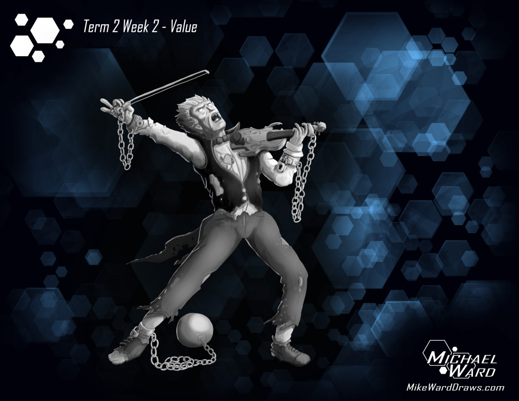
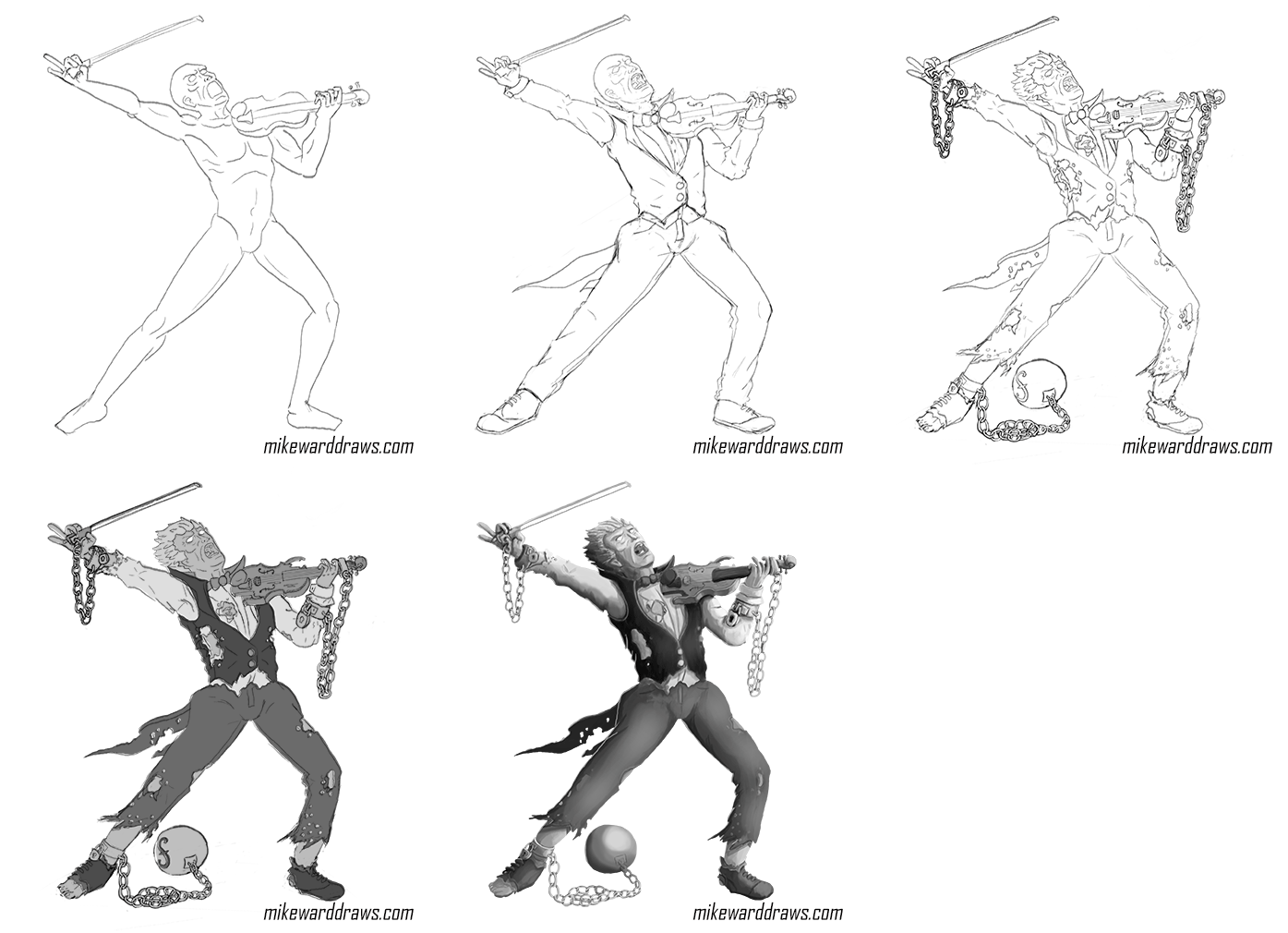
violinfinishedAre you in awe of the sexy? I can tell that you are. So this week I learned that I’m totally awful at rendering. This guy. This one little guy with his little violin and his puffy pants. I drew him for days. DAYZ! But that’s the point of this nonsense, right? To be slow at first and get faster with mileage? Did I mention how tired I am?

Oh! And I created an animation of the process because I wasn’t already too busy what’s wrong with me. It’s a gif so it should be doing stuff. If it’s not changing then… I don’t know. Fix it.

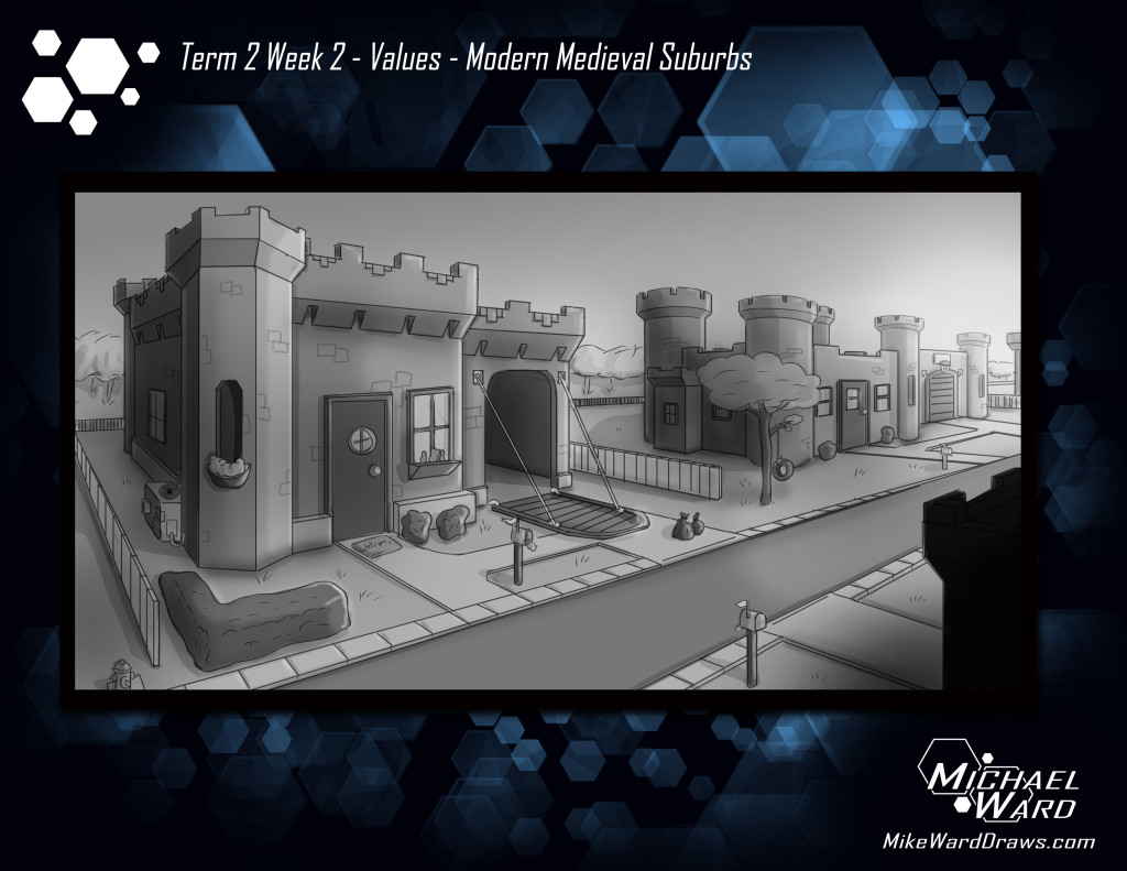
violinprocessI think I mentioned in the last post too that I had to do a city scape. I spent WAY less time on this. I’m sorry Adrian. But I’m pretty pleased with the concept. I may develop this further in later assignments.

castlefinishedGet it?! It’s a suburban street if Medieval architecture was still current. Haha. Oh man. What nonsense. What a crazy kooky world that would be.

…so tired.

Ok so class actually starts in about 12 minutes. I literally just uploaded it all. I’m the worst student.

Michael

Character Design 1: Part 1 – I’m An Idiot

I’m an idiot, Diary.

It’s 2am Sunday morning and I’m still working on my assignment. I worked on it the last 3 days. Here’s why I’m an idiot:

I HAVEN’T STARTED THE ACTUAL ASSIGNMENT YET! Why do I do this???

All I have to do is render a character. Just a black and white image that shows where shadows are and where highlights are. I could easily have done my paranoid book guy from the last assignment but nooooo. I had a new idea for a new character. And I wanted to do it official like, too. Really use what I’m learning.

The premise? A guy cursed to forever play the Violin! Aww yeah. That’s new…ish, right? It’s basically my take on the Faustian myth. Think Robert Johnson but with a violin instead of a guitar.

First the design draft (on super sexy template):

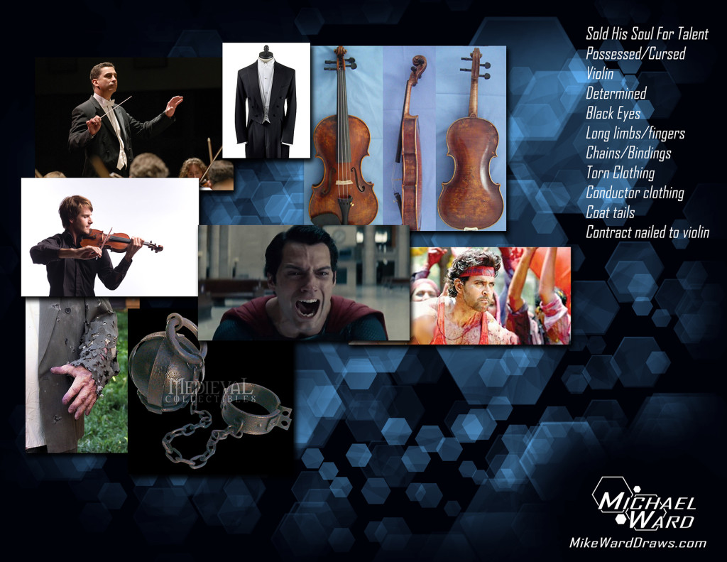
violindesignboardsmallAll the real important stuff is there. Clothes. Violin. Look of tortured anguish. Another violin. Truthfully while doing the drawing I used even more reference images but just with google images on my other monitor.

The silhouettes and choosing a pose.

violinmansketchesI have a bad habit of erasing stuff that doesn’t work right away. I’m trying to stop that. Anyway here you can see where I tried different poses with stick drawings and different anguished faces. The silhouettes are straight forward. I knew he was dressed like a conductor and he had a violin. I just needed enough drama to look like he’s miserable. I decided on the last one because it’s the most open.

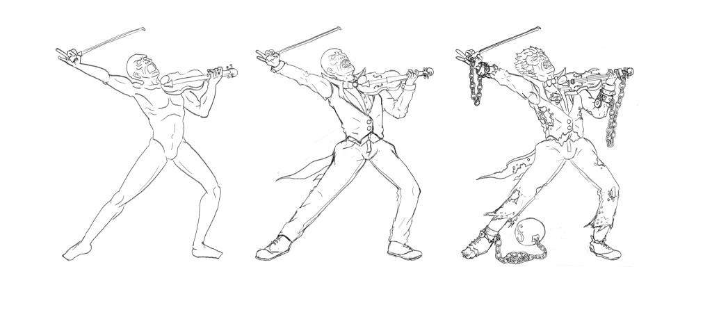
And now the three steps towards a finished drawing:

violinstepsI actually don’t hate the naked guy! It’s my first ‘anatomical’ drawing that wasn’t garbage. Granted I didn’t draw many of the muscles but you know they are there. Next I dressed him. I’m not sure there are vests with coat tails truly but I thought it looked cool.

The final step, of course, was cursing him up real nice. He’s chained to both the violin and the bow. Clothes are wearing out because he cannot stop playing. He wished to be able to play the violin. Now it’s all he can do. I guess moths or something are eating the clothes off him too. I originally wanted a contract nailed to the violin but it covered up too many details so I scrapped it. Did you see those chains?! They actually didn’t take long to draw. I could have drawn more, even. It’s fun.

SOOOOO I guess I’ll get back to work. Rendering time! Wish me luck. I hope I don’t ruin it.

Lurf Michael

P.S. Did I mention I have to render a cityscape this week too? And my plan for that is just as convoluted? I’m the worst.

Background Image Template

Hi Diary,

I’m exhausted. My family runs an auction company (www.wardsauctions.com) and we just had our annual Thanksgiving Day auction. I like my job most of the time. Making an auction is good fun. But the actual auction… I could call in sick that day.

ANYHOO! Remember I said I was going to work on a template image to put my assignments on?

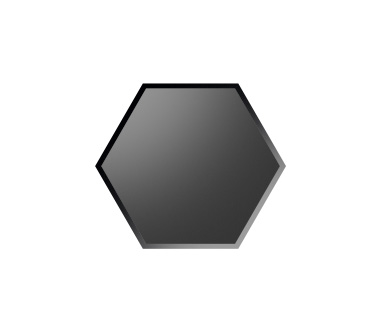
backgroundtemplatehexagonsPretty slick, right? I actually used techniques I learned from my teacher last term to make it. Gasp! Did you see that Tom? I learned something from you!

I made a custom brush of a hexagon. To give it a little depth I lowered the flow of my eraser and dragged it across the top left area to imply a highlight. For the border I reversed the value of the interior.

hexagonbrushshape

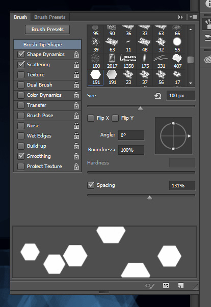
Then I adjusted the brush settings to increase the scatter and spacing and giving it a random size (jitter).

hexagonbrushshape2I’d give the exact settings but I’m lazy. After I had it all set up I just randomly changed the brush size from big to small and just draw random squares until I liked it. I used the eraser where some parts got a little bright.

So there you have it. Let’s see it in action:

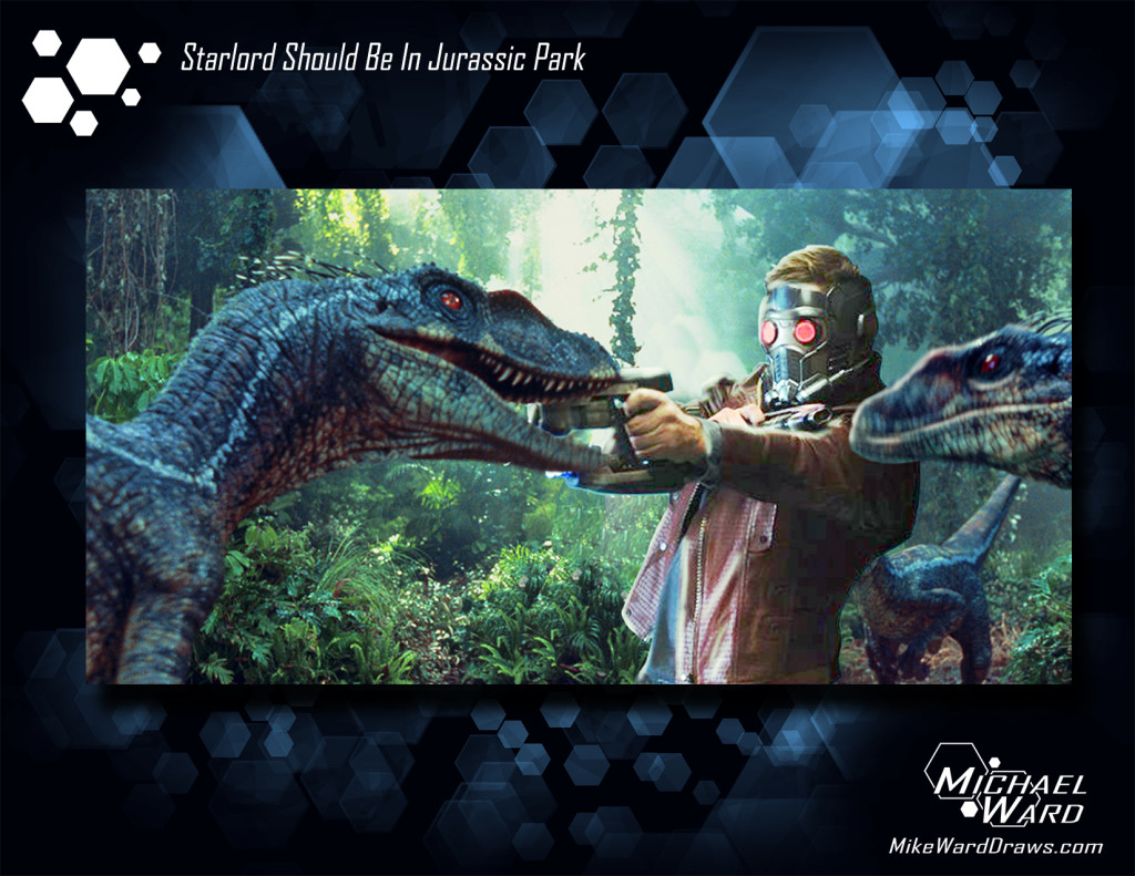
starlordhexagon

I photoshopped Starlord into the Jurassic Park franchise. If that background doesn’t make it look official then I don’t know what will. I’ll email it to Universal Studios when I’m done writing this blog post. Maybe now they’ll take me seriously.

Luff Michael

Term 2 first assignment! Character Design Planning

It’s a new term, Diary!

At first I was all “Oh noes. I don’t want a new teacher. I liked Tom Jung. He’s mellow and nice and good at the art stuff.”

But then I was all “Hey! It’s Adrian Enciso! I missed his crazy energetic voice!” Adrian was the teacher I had during the Intro Concept Art class at www.vanas.ca at the start of this year. (I blogged that 4 week class at www.fuzzyoutlaws.com) And clearly he was a good teacher because as soon as the intro class ended I was already signing up for the diploma program. But truth is that even if he wasn’t a good teacher, I probably still would have enjoyed the class. He has so much energy in his voice that it really makes you want to draw just to have as much excitement as he seems to be having.

…either I’m really easy to please or VANAS hires good teachers. ‘Though I’ve only had 2 so it’s hardly a good statistic.

Holy cow I haven’t even talked about the assignment yet. It’s Design Planning! WOOO! (Super not exciting!)

One week in and term 2 already feels very different. Adrian is really pushing me to understand what working in the industry is like and what is expected of me. Term 1 was pretty much just teaching me how to draw better but not specifically for concept art.

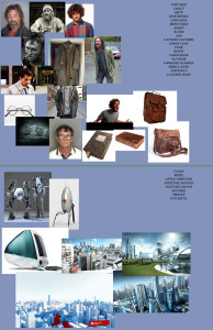
So assignment one (why is it taking me so long to get to it?!) I had to create a design board for a character and a cityscape. ANY character. And ANY cityscape. So I created these.

designboardsI made a list of traits I wanted the character to have and then found images through google to use as fast references while drawing. The design board almost has to show you the character before you’ve even made it.

Overall he said I did pretty good on this part which is pretty neat since it was my first try. BUT the presentation was awful. Images just thrown about on a flat blue background. Blegh. I could never show that in my portfolio or while pitching a project to someone.

And that’s just it. It never even occurred to me to show another person this. Nevermind having it in my portfolio. But that is apparently part of being a concept artist. And every image I show (especially in a portfolio or pitch) has to be as impressive as I can make it. So tonight (after writing this) I’m going to work on a template. A flashy background/setup to show stuff I’ve drawn on.

After that I drew the character.

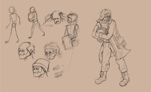
characterI’m actually pretty pleased with him. Sort of a homeless/runaway guy. He’s got a book full of “who-knows” and he’s running from “whoever”. I was supposed to show as much about the character as possible with only one image using clothing and facial expressions and even the pose.

One major issue though is that his chest is covered. If I was creating this image to show the rest of the production team then everyone would have to guess what his mid-section looks like. BUT by folding his arms over the book it also shows that the book is important and that he’s paranoid. So I picked a tricky character for this. My bad.

I also should have created a mannequin of the character 3 or more times and drawn different clothing or hair or all of that on him. One version is never enough in a working environment. I know now for next time.

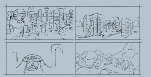
cityNow that cityscape critique didn’t go so bad. Some things I need to work on of course but I major thing is my scale. I chose reference images of very detailed and huge cities. And then I tried to draw large cities in my thumbnails. (They are supposed to be drawn fast and rough like that). Really a focus on one or two buildings was all I needed to do to create the design of the city. Again, I know for next time.

Overall I got 76% on the assignment. I’m starting to think I’m not the prodigy that I thought I was. I better stop writing and practice drawing.

Lurve Michael
Term 1 Recap and Teacher Profile

Dear Diary,

3rd post of the night. I’m all caught up. Go read the previous two for my last two assignments first. Go ahead. I’ll wait. (I won’t wait. The internet doesn’t work that way. Grow up). I haven’t proofread anything I wrote today. Spelling errors? Grammar issues? You betcha!

Term 1 was super fun and super hard. Seemed like I was late on every second assignment from babies and auctions but Tom, my stupendious teacher, was really nice about it. I always made sure to have the assignments done before the critique class so I don’t think it inconvenienced him anyway.

Stupendious was an intentional spelling error this time. Stupe-en-dee-us. Sounds more stupendous. Grow up.

Let me tell you about said teacher:

Tom Jung: www.thejungkyard.com

The dude is brutal. For serious. I’m all “Hey Tom, I totally spent 100 hours drawing this foot special for you” and he was all “This is a foot?”

I’m kidding. He was brutally honest but in a constructive way. He wouldn’t tell me what I did wrong without drawing all over my assignment and showing me what it should have looked like. And he drew fast! Like seriously fast. I asked him how the muscles on the back overlap with the side and he drew an entire freaking muscle guy in 3 minutes to show me all the anatomical details.

Look at this from his online portfolio. (I hope he doesn’t mind I stole it. GO LOOK AT HIS WEBSITE!)
tomjungexampleLook at that. I asked him how long it took to draw. He said 8 hours. I said “Ok, I quit” and we laughed and laughed. He probably thought I was kidding about quitting. 8 hours! 8 months maybe. I take back calling him stupendious. Now I hate him.

Nah, he’s still great. I’mma miss learning from him. Hopefully he’ll get a chance to be my teacher again over the next 18 months. He should be so lucky, right? I’m probably his favorite student.

I was going to post some of my assignments on here again but really you can just scroll down the website to see them all. It would take 5 seconds.

These posts are probably all really ramble-y and disjointed-y. It’s 2 am. I’m going to draw something. Something stupid probably. Grow up.

Michael
Lesson 11: Faces

Another post, Diary.

I just wrote the last post like 2 seconds ago. Trying to catch up because TERM 2 STARTS TOMORROW! YAY! I’m going to write a post about my first term recap and my teacher tonight also. Holy moly. But first:

Lesson 11. Faces!

This was a haaaaard assignment. This term we learned about skulls and basic human anatomies and the like. I know where eyes go (mostly) and ears and noses and junk. I can map a face like a pirate maps his treasure. BUT I haven’t been taught how to draw the dang nose. Or eyes. Or anything.

So I winged it. Wung it? What’s the past tense of Wing? I Wanged it (nailed it).

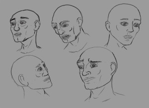
faces

Obviously flawed. Ugh. Look at those gargoyles. A big part of the issue was the eyes. Remember I said I mostly know how to map them? Well turns out eyes don’t sit ON the face. They sit IN the face. Obviously everyone in the world knows that except me when it comes time to draw it. If I actually traced the entire eye balls on those faces they’d be sticking out of their cheeks. Bad work this week, Michael. Bad.
The other issues were pretty much everything else. But they are more forgivable. I’m only drawing eye patches from now on. On an unrelated note if someone did lose both eyes would they wear two eye patches? On a somewhat related note if someone missing an eye cries, does the socket fill with tears? I have some googling to do later.

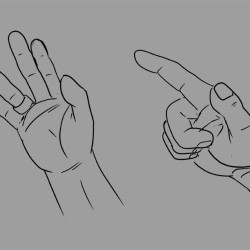
I also drew hands. Reference ones and imagination ones.

hands1 hands2 hands3 hands4

I draw fat fingers. I’m mostly happy though with what I did. The first reference photo was such a stupid choice. It looked funny from the start and even worse when I started drawing it. My teacher pointed out that it was photoshopped and the thumb was moved out of joint. Ugh. Sabotaged.

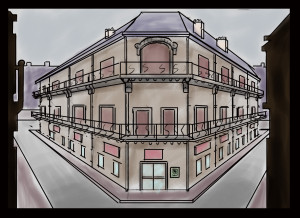
And finally I had to do more architecture stuff. Blam:

oldarchitectureeditMy teacher, Tom, said the perspective was dead on so I was totes happy. BUT the rendering was pointless. The shadows were too light to really matter. It took me hours to draw this silly building and in 15 minutes he coloured it up with shadows and reflections and just made it look amazing.

Anyway this was my very last assignment of the term. Term 2 class starts in 15 hours!

L,
M

Lesson 10: Silhouettes

Diary! I missed you so much!

It’s been a bleeding month since I updated you. I can explain. My babies been sick for a month straight and I worked two auctions. Did I mention on here that I work auctions? I do that. They take a lot of my time.

But I still did my homework so here is the lesson 10 assignment and how I sucked at it.

Silhouettes! I had to make them. There were almost no rules really. They had to be readable and had to be characters. Real or cartoony it didn’t matter. Naturally I went for cartoony.

silhouettes2To answer your question: No, I don’t know how I got so amazing.

All right. False cockiness aside I did pretty good on the assignment. My teacher suggested a few tweaks here and there but ultimately understood what I was doing for all of them.

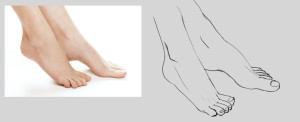
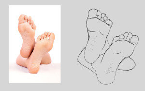
I also had to revisit feet with this assignment. First drawing from reference and then imagination. The ones with photos beside are the reference ones because obviously.

feet1 feet2

And I have to say the practice is paying off. They aren’t perfect but it only took me 15ish minutes to draw each one. 6 months ago that would have been my whole evening.

feet3 feet4

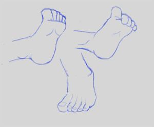
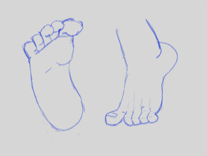
And from imagination. That was obviously much trickier. What I wouldn’t give to have a photographic memory.

Lurve Michael