I’m doing something different today, Diary. The following is basically a cheat sheet for people that want to learn to draw concept art but have never tried before. My brother Peter has big ideas for characters and creatures but no idea how to put them on paper with pencil. This should help get him started faster.
Mike Ward’s Beginner Guide To Concept Art
(AKA Let’s Draw A Space Mermaid)
I’m going to show the wrong way and right-ish (right for me) way of drawing a mermaid if it ‘swam’/flew through space.
The Wrong Way: Drawing without constructing.
You’re not drawing a bowl of fruit that you can just put in front of you. You’re drawing something that doesn’t exist except in your head. Don’t assume you can just draw perfect character from scratch.
My attempt:
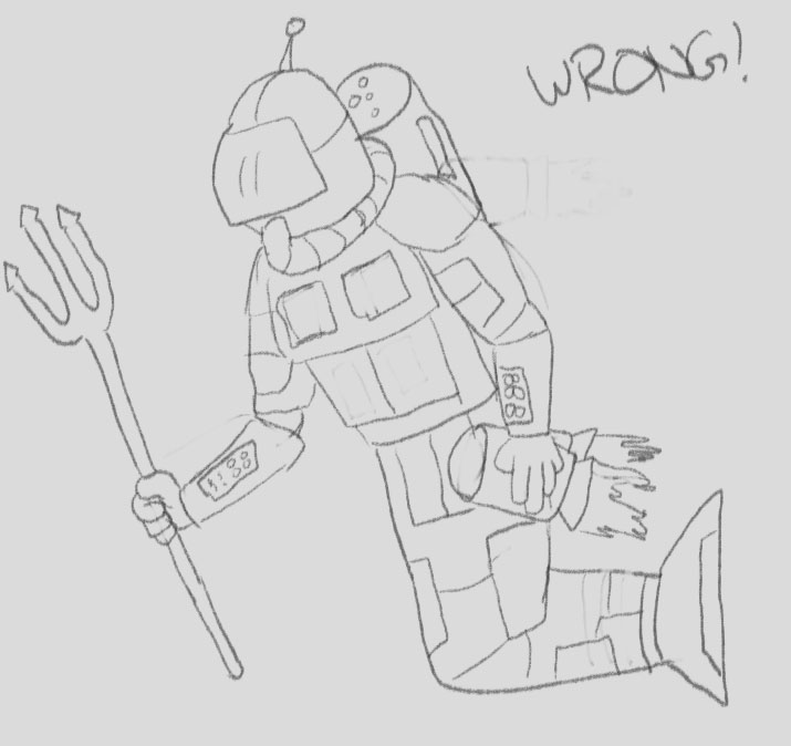
This took me about 20 minutes. I didn’t plan out the pose at all ahead of time so the jets are covered by the arm. There is very little dynamic about this character at all. Obviously I can spend more time adding details but that won’t help the limb positions and
The Right Way: Building A Character
Step 1: Warm Up
Every book you buy will tell you to warm up your hand before drawing and every professional does it too.
Draw the 3 main lines that every artist uses: CSI
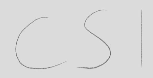
Also draw circles and ellipses. Then draw over them. Over and over again. Try to keep the lines as clean as possible but do it fast. Fill an entire page. Draw lines of different sizes. Change the angles.
And try to draw from the shoulder. Move the whole arm. Not just the wrist. Spend 10 minutes on it. Here’s a short example of what your page will look like but try to draw more than this:

Step 2: Find Reference
Do you know what a space mermaid looks like already? Me neither. Better find some reference images:

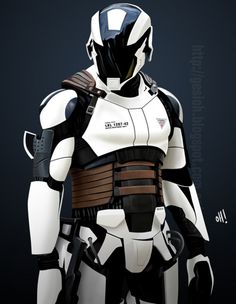
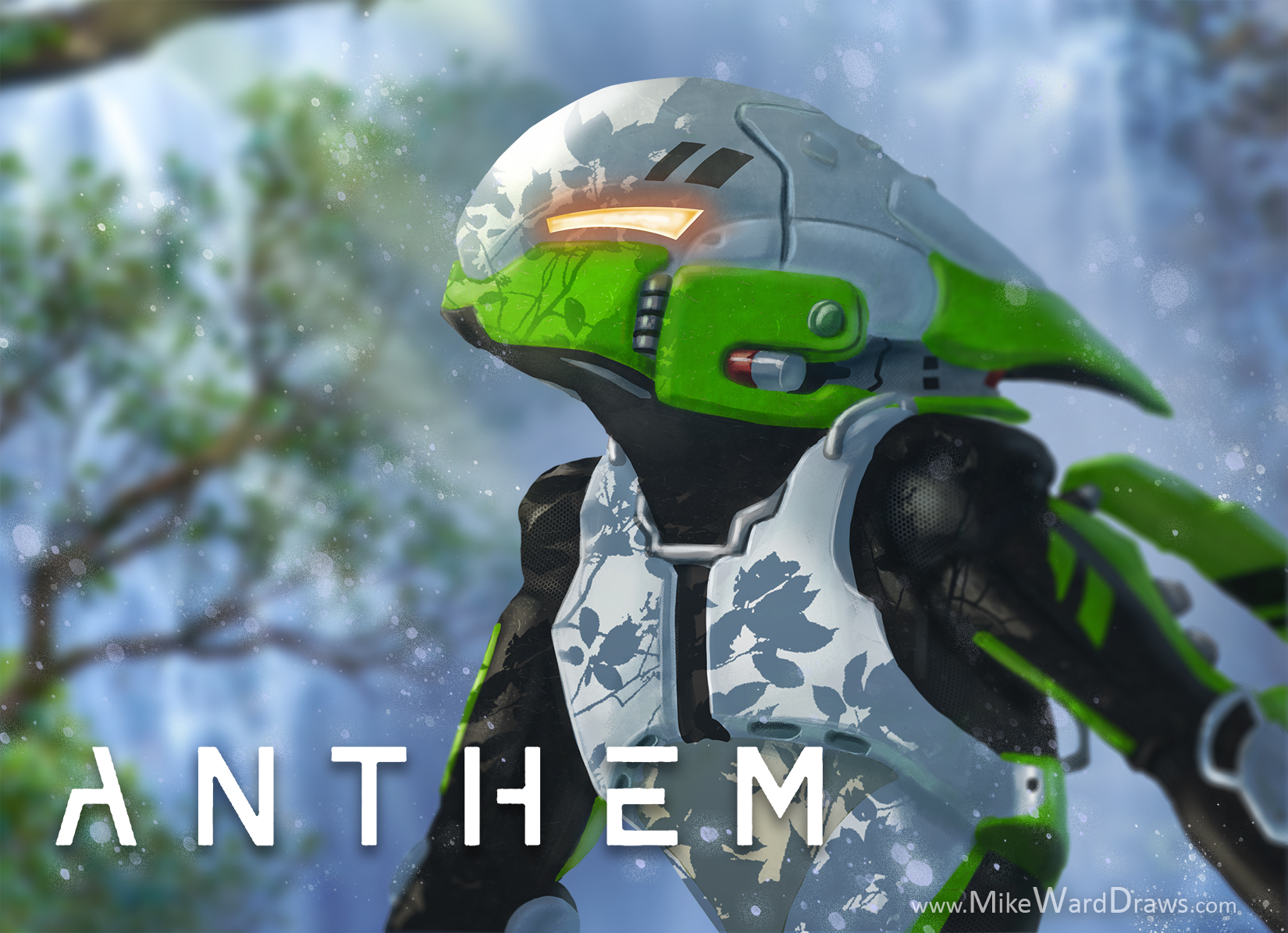
Use lots of references if necessary but for now here’s just two that I’ll use. A mermaid ad for Evian water and a Total Recall security suit. I’ve tried to find the original artists of both of these works but I can’t find either. Unfortunately there are no real pictures of mermaids so I have to use other artists renditions for this project. Try to use real pictures when possible. You can also skip mermaid pictures and just find neat fish you like.
Step 3: Thumbnails
Thumbnails are tiny drawings that let you try out different ideas REALLY fast. Figure out the poses and some of the larger details. Experiment to see what you like.
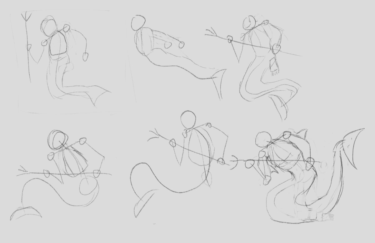
I like the last pose. Two hands on the trident and body pointing forward with tail going back. I started to play with some of the other details but I’ll actually play with the armor after I build the form.
Step 4: Stick Figure
Just draw a circle for a head and a gesture line for the body. I like to draw a kind of triangle to show the rib cage and another circle for the butt area. Normally I’d have the gesture continue into one of the legs but…mermaid.

The point of keeping it simple is that if the arm is in the wrong spot you can move it now before you’ve added all the details. It sucks when you have to erase a fully realized limb because you didn’t plan ahead.
Step 4.5: The Face Plus
Everyone draws this + on the face. It’s to show where the character is looking.
Step 5: Add Simple Forms
Time to bulk this dude up but don’t go drawing in neck veins and battle scars. Just get the form down.