It’s a new term, Diary!
At first I was all “Oh noes. I don’t want a new teacher. I liked Tom Jung. He’s mellow and nice and good at the art stuff.”
But then I was all “Hey! It’s Adrian Enciso! I missed his crazy energetic voice!” Adrian was the teacher I had during the Intro Concept Art class at www.vanas.ca at the start of this year. (I blogged that 4 week class at www.fuzzyoutlaws.com) And clearly he was a good teacher because as soon as the intro class ended I was already signing up for the diploma program. But truth is that even if he wasn’t a good teacher, I probably still would have enjoyed the class. He has so much energy in his voice that it really makes you want to draw just to have as much excitement as he seems to be having.
…either I’m really easy to please or VANAS hires good teachers. ‘Though I’ve only had 2 so it’s hardly a good statistic.
Holy cow I haven’t even talked about the assignment yet. It’s Design Planning! WOOO! (Super not exciting!)
One week in and term 2 already feels very different. Adrian is really pushing me to understand what working in the industry is like and what is expected of me. Term 1 was pretty much just teaching me how to draw better but not specifically for concept art.
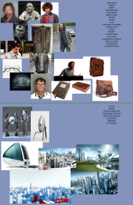
So assignment one (why is it taking me so long to get to it?!) I had to create a design board for a character and a cityscape. ANY character. And ANY cityscape. So I created these.
 I made a list of traits I wanted the character to have and then found images through google to use as fast references while drawing. The design board almost has to show you the character before you’ve even made it.
Overall he said I did pretty good on this part which is pretty neat since it was my first try. BUT the presentation was awful. Images just thrown about on a flat blue background. Blegh. I could never show that in my portfolio or while pitching a project to someone.
And that’s just it. It never even occurred to me to show another person this. Nevermind having it in my portfolio. But that is apparently part of being a concept artist. And every image I show (especially in a portfolio or pitch) has to be as impressive as I can make it. So tonight (after writing this) I’m going to work on a template. A flashy background/setup to show stuff I’ve drawn on.
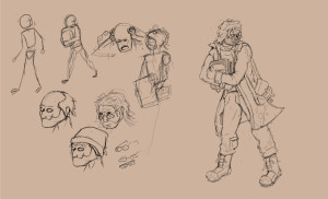
After that I drew the character.
 I’m actually pretty pleased with him. Sort of a homeless/runaway guy. He’s got a book full of “who-knows” and he’s running from “whoever”. I was supposed to show as much about the character as possible with only one image using clothing and facial expressions and even the pose.
One major issue though is that his chest is covered. If I was creating this image to show the rest of the production team then everyone would have to guess what his mid-section looks like. BUT by folding his arms over the book it also shows that the book is important and that he’s paranoid. So I picked a tricky character for this. My bad.
I also should have created a mannequin of the character 3 or more times and drawn different clothing or hair or all of that on him. One version is never enough in a working environment. I know now for next time.
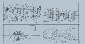
 Now that cityscape critique didn’t go so bad. Some things I need to work on of course but I major thing is my scale. I chose reference images of very detailed and huge cities. And then I tried to draw large cities in my thumbnails. (They are supposed to be drawn fast and rough like that). Really a focus on one or two buildings was all I needed to do to create the design of the city. Again, I know for next time.
Overall I got 76% on the assignment. I’m starting to think I’m not the prodigy that I thought I was. I better stop writing and practice drawing.
Lurve Michael
