Matte Painting – Destroyed Paris

10 days ago, or so, I wrote 7 posts. Today I’m just doing 2. Way easier.

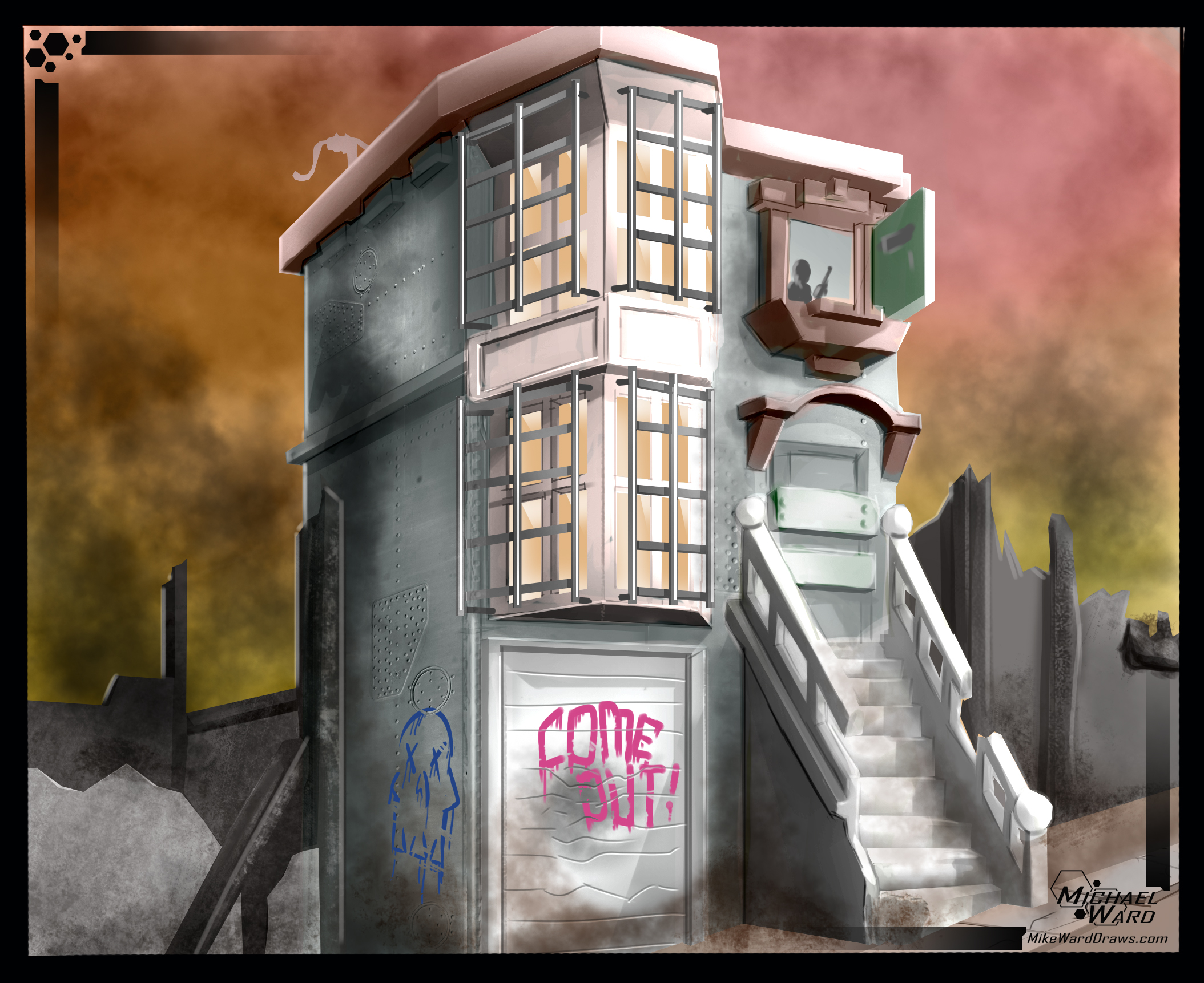
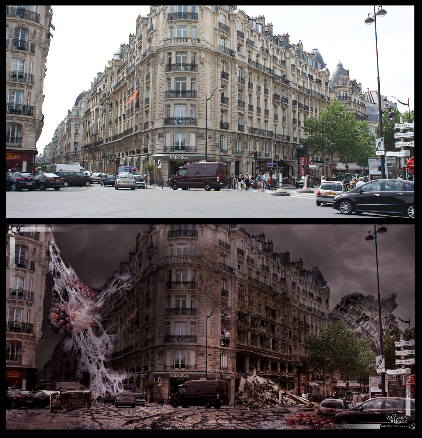
The school tasked me with creating a matte painting. What the heck is a matte painting? Well, it’s the ultra-high def cousin of concept art. And it’s actually pretty amazing. (Do yourself a favor and googled ‘digital matte painting’)

Matte painting serves to fill an environment in film or movies. Like if a character is standing in front of a destroyed town, you can assume the prop makers didn’t actually destroy a town. A matte painter just painted one in the background.

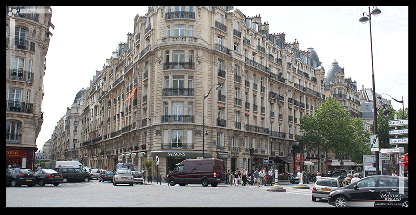
I started with a picture of Paris because I really like that place (I eloped there with my wife!)

matteparisbefore

Then I set about destroying it! I started blending other pictures on top and painting in areas and changing the lighting and junk. I wanted to create a world that was destroyed by a fungus or an insect or something.

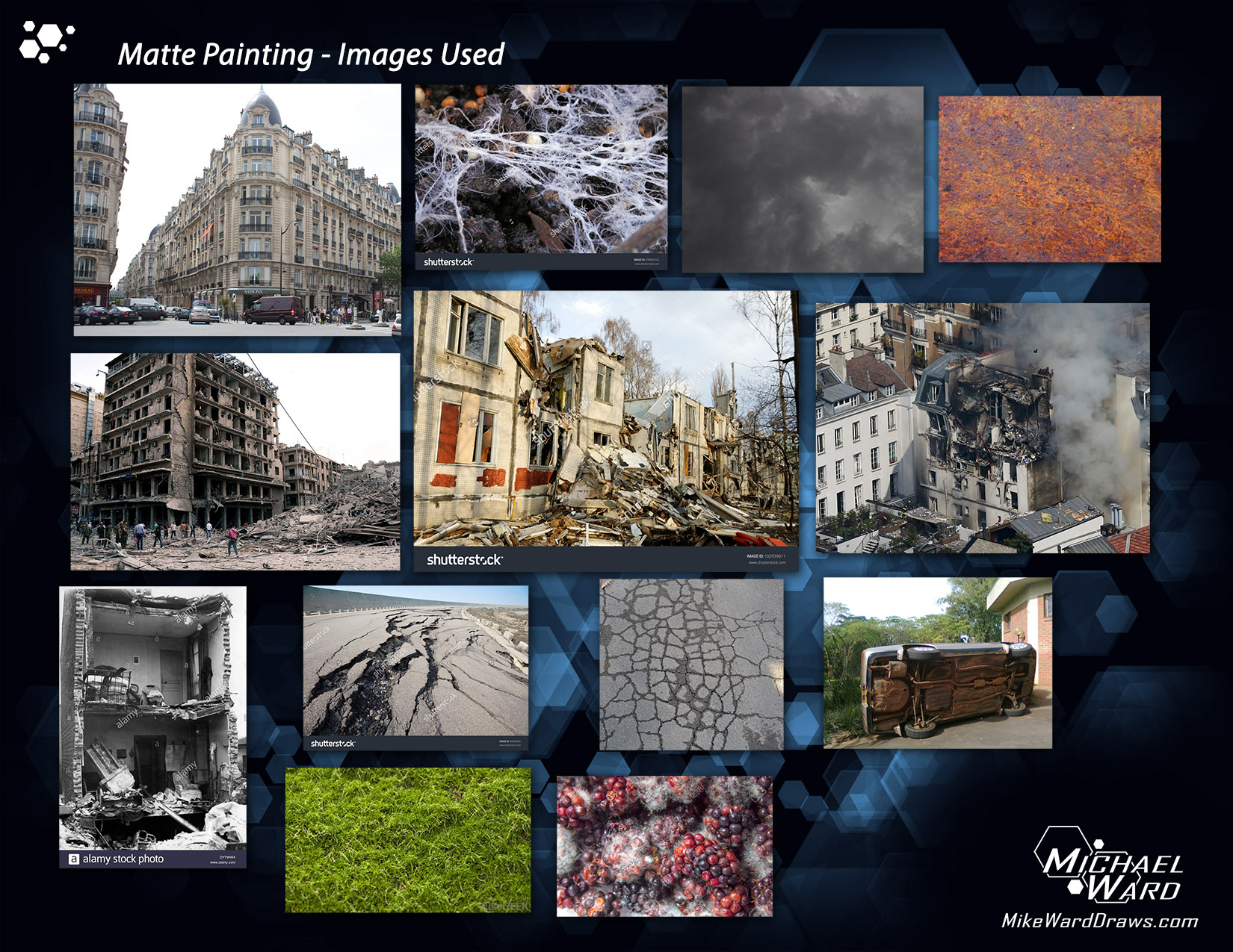
These are the images I used to create the scene.
imagesused

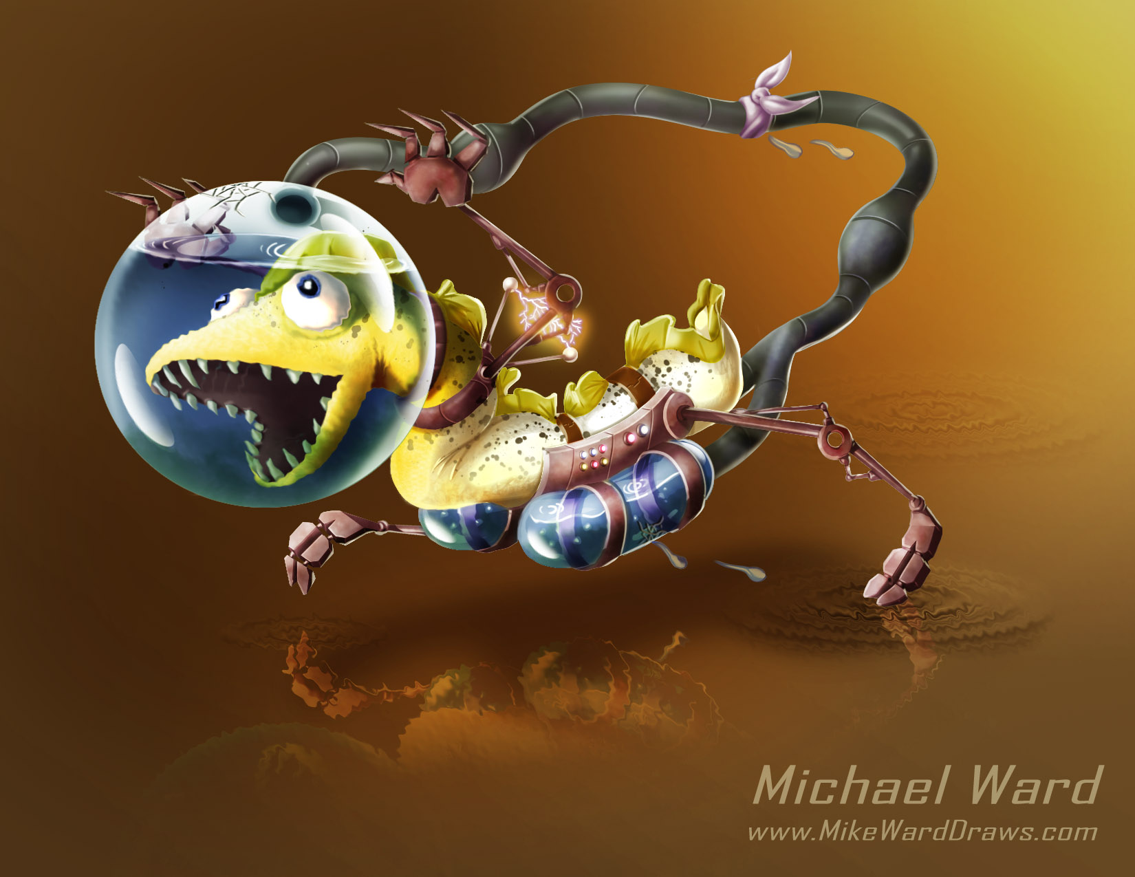
And THIS is the final imageparisdestroyedv5
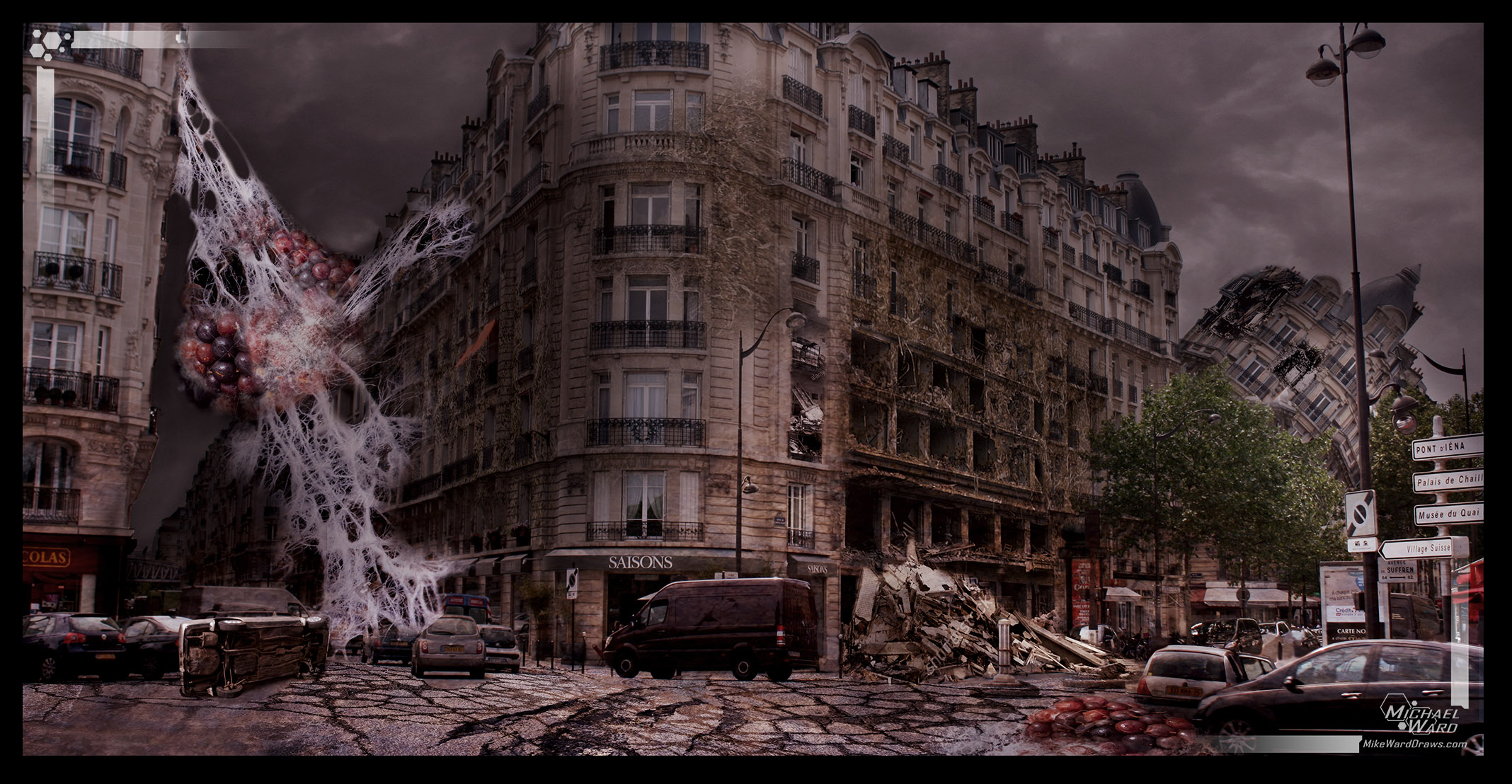
How did I do? The ‘eggs’ (or whatever) are actually just moldy blackberries.

What to compare it to the original? Here yah go!
combinedv2
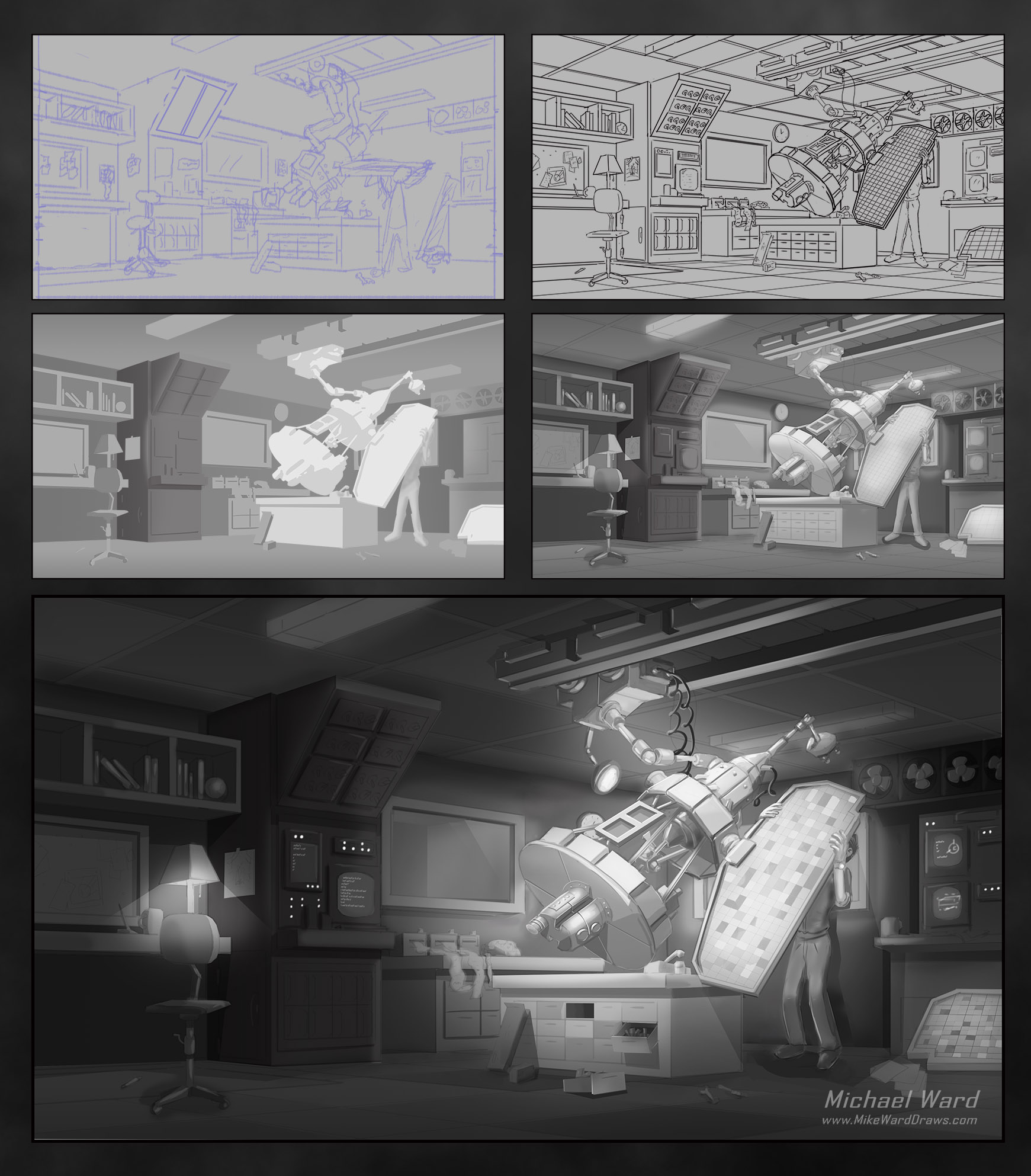
And of course… the animated process.
matteanimationMichael

Clockwork Globe

(Last post tonight)

This post is the one I’ve been most looking forward to writing tonight. This is about the image I’m the most proud of ever. Not just during my time in art school.

The assignment was to create a prop. Any prop at all. Big or small or soft or hard or complex or simple. Anything that wasn’t a character, animal, vehicle or weapon, basically.

And just like the rest of the summer; I was way behind on my assignments. I was going to go simple. I failed spectacularly at that. I tasked myself with creating a Clockwork Globe. A planetary globe of Earth that is controlled by gears that would change the plates to show how the continents changed over millennia.

During the thumbnailing stage I didn’t realize how complex this idea is:

thumbnailsJust a few gears and poles poking about but mostly just flat or round smooth surfaces.

During the line art I started to figure out how dumb I was:

globewipI really struggled with the perspective at first and I started over 10+ times. I know for concept art it doesn’t need to be 100% perfect but I wanted this to be done right. Even though I was so late on my assignments and I was currently working 10-12 hour days I just wanted to make this image.

And this is the finished image.

globe50percentI was so late with this image that I had to simplify so much from the line art. The gears at the bottom aren’t nearly as complex as I imagined. The engraving on the wood isn’t there. But I am so happy with this. There are flaws and missed opportunities but so many times while drawing this I started sketching simpler props. I gave up completely on this picture every single night only to wake up ready to fight it more each morning.

And for fun here it is animated:

globeanimFor my next assignment I WILL go simpler.

Michael

Rabbit Turnaround

(6th post tonight- holy moly)

This will actually be a very short post even though it feels like it should be a long one. A Turnaround is when you show what a character, object, etc looks like from different angles. The assignment here was to show a character from the front as well as the back. I could use a character I had already created in the past or completely start over.

Using an existing character sounded like the smartest way to go. Especially since I was so far behind in all my assignments. But I knew that my previous characters were pretty complex and I wanted to do something simple so I could catch up. I did some simple thumbnails and I ended up with:

sketchwipv1A turtle. A bad turtle. I figured it had smooth skin with almost no weird hairs or bones or joints or items that needed to be rendered. Plus since I had to draw him from behind it would be way different from the front image because of the shell.

I played around with it during the line art but for some reason I just decided it would take too long. So I went back and looked at the silhouettes I did in the first term:

silhouettes2

Most of these didn’t seem really all that complicated but I wanted really simple. I decided the second guy from the bottom. The rabbit.

Then I did something I had never done before. I sketched, lined, valued, coloured and textured an entire character in one sitting.

rabbitturnaround1I’ll admit that the character is simple but man that felt good. For me I always sit down and think that concept art should take a long time. The professionals are fast and know what they are doing. I’m slow because I’m new.

This time I knew what I needed to do and I did it. The next day I sat down and I did it again.

rabbitturnaroundThe behind side took a little longer (especially getting the legs into proper perspective) but it still wasn’t the struggle that most of my assignments have been.

My school, The Vancouver Animation School, works. It’s that simple.

Oh also I was pretty pleased with the colour of the character.

Michael

Space Apartment: Revenge of the Paintover

(4th post tonight)

Remember that time I complained about how hard Paintovers are?? It basically just happened. Two posts ago. (About 20 minutes ago, for me).

I had to make an interior as a paintover. And I was going to do better! I’ve been so disgusted with my last few assignments that I even wondered if Concept Art was really what I wanted to do for a living. BUT OF COURSE IT IS!

So I found a neat photo of a room for a base and I started to draw over top. After a few thumbnails I decided on this:

spaceapartmentYou can see the original image, both the image and sketch, and finally the sketch on it’s own. An apartment on a space station or a space ship. Complete with hologram computer and jellyfish tank in the back corner.

scifilinesThis was the first line art I had done in a very long time that I didn’t hate. The perspective was right and the level of detail was higher. I had wanted to do other details like a butler robot but I decided to do less and do it better. Plus I find the emptier room seemed more ultra-modern.

I wanted to really emphasize the computer in the corner so I zoomed way out and using a soft brush I did just the values. Light parts that I wanted to stand out and dark everywhere else.

apartmentvalueswipThen I used that as a base to do clean values.

apartmentvaluesv2I was pretty happy with it… until I went to colour it.

apartmentcolorswipEek. I knew I wasn’t near done colouring it but that screen was killing me. Every time I tried to fix it things got worse. It didn’t look high tech at all. One of the focal points of the image because it’s worst feature.

I completely redid it and I was so glad I did. For once I didn’t hate the final image as much as I normally do.

apartmentfinishedOf course this image was way late by the time I handed it in. I would have fixed the values on the couch and changed the way the room was reflected on the glass ceiling. I also would have added texture. Right now everything is smooth and made out of plastic instead of all the brushed metals and ceramics that I wanted.

Perhaps this one I can fix up for my portfolio. Hmmm.

Michael

Set Breakdown

This is the 3rd post I’m writing tonight and probably not the last. A weight will be lifted after I’m caught up logging all my assignments.

In term 3, week 5 I learned about Set Breakdowns. These are when an artist takes a image and starts to explain some of the details. Like if you drew a house, you may do a simple blueprint of the floor to show off how all the furniture is laid out.

It was a neat assignment because I had to take an existing image that I had created earlier in the program to expand on. I had very few environments which pretty much stuck me with the Post Apocalyptic San Francisco House (longest name ever).

combinedYikes that house exterior is brutal. It’s VERY clear that I need to work on my exteriors more than anything. But I liked the way the interior linework was coming. Bordered up windows and all that.

The more astute of you may have noticed though that I added a whole area on the left side of the building past the bay windows. Obviously that’s no good. I had to go edit the original image:

sanfrandetailsSee that? I still hate that house but it was a neat experiment to move that wall out and make it seem like it was always like that. I also added flat value to the room. It was up to the student to decide how detailed they wanted to get with the set breakdown. I intended to go to full colour but (you guessed it) I ran out of time.

Michael

Term 3 Begins

Where the heck have I been, Diary?

How long has it been since my last post? Hang on, let me check.

23 days?! That’s more than 3 weeks! Also how dumb is it that I told you to wait while I checked? I could have skipped all of that.

Yup, term 2 has ended and Adrian isn’t my teacher anymore. And that sucks because he was aces. I’m going to make a LinkedIn account soon and get him on there so we can keep in touch.

The last two weeks of the term had no assignments and then they had a reading week so I’ve had nothing to post. I mean I have art stuff going on but nothing I can talk about just yet.

o_0

Actually I have LOTS of stuff to talk about and some I’ll talk about on here and some will be elsewhere.

o_0    again

Anyway, the new term started and I’m very excited. And my new teacher, Todd Marshall seems awesome. He likes dinosaurs and space ships and pretty much everything I care about. He’s also the most “rock and roll” artist I’ve ever met and that’s cool too. I’ll write a post about him later but for now check out these balloons I had to draw!

balloonproofsThat’s literally a copy of the artwork proof they sent me to approve from the files I sent them. It just makes me laugh that they have to get something so silly approved. I was given 30 minutes to draw “anything a kid would like” so fat dinosaurs and space ships is what they get.

Ok bye,

Michael

A Year Of Progress

It’s been a year since I started the Concept Art Diploma class at the Vancouver Animation School, Diary.

I was recently messaged by a prospective student, Adriana, through my Facebook art page. She wanted to know what I thought of the school. It’s probably obvious that I think the world of the school. The assignments and the teachers are exactly what I need to grow as an artist.

I did, however, mention that some of the recorded lessons could do with a redo. The teachers that recorded them are clearly very good artists. The school did a good job finding talent. But it’s also clear that most had never recorded a process video before. There are a lot of long pauses and hesitations as they think about what they want to say next. Or they may go long times without saying anything at all. For a first try they aren’t bad, of course. But perhaps a second or third recording couldn’t hurt so that they really know what they want to say and can do it succinctly.

In the end, though, the real evidence about how well the school works is in my art progress. Last March (a year ago!) I applied for the schools scholarship and I had to create a bunch of specific artworks. Let’s compare last year to last week, shall we?

creature3Oh. Oh no. I think I’m going to be sick. *pukey noises*.

eelorangeAh, that’s a little better. I’m sure in a year from now I’ll make pukey noises from my Eel too but compared to the snail I am WAY more pleased with it.

Let’s look at the man-made environments:

landscape2smallWell I definitely like this more than the snail. But it’s just boxes. Flat boxes in a row. In 1 point perspective even. For shame.

computerlabv3Aww yeah. That’s better. It’s only been a week and I already see a bunch of little things I’d like to touch up or redo but I really think I’ll be adding this to my portfolio.

Only one more year to go. I already know I’ll be sad when it’s over. I’m sad now just thinking about it.

Love Mikey

1960s Computer Lab Values

Hi Diary,

As promised here is the completed 1960’s Nasa Lab. By completed though I only mean the black and white values.

computerlabfinished_halfsize I animated the process again.

computerlabprocessI spent way to much time on this. Clearly I’m a slow artist. I’ve barely done anything to the Eel image either. I have roughly 23 hours until that needs to be uploaded. Ugh. But I’m proud of what I did here.

It really shows you how effective the school is. I handed the image in as ‘complete’ WAY before it was complete. I thought it was so good but my teacher showed me in just a few minutes how to make it stand out.

Here are the individual steps unanimated for those that want a close look. Before my teacher gave me his advice my image looked like something between steps 3 and 4.

computerlab_steps

Now I have to finish the eel picture and it’s so far from complete. I have 23 hours to upload before it’s considered late. Wish me luck!

Michael

Post Apocalyptic San Francisco House – Critique

Is this the longest title I’ve had for a blog post? Gotta be top 3.

Hi Diary,

I’m all caught up with my homeworks! It’s a good feeling. I was caught up last Wednesday actually but I didn’t write about it because I was enjoying not having an upcoming (or passed) deadline.

Wait. Is it a “passed” deadline because I passed it? Or a “past” deadline because it’s in the past? I’ll say it’s a pasted deadline.

First of all though I updated my rabbit from the previous assignment. Fixed some obvious errors and textured the background a bit.

rabbittree2Feel free to send copies of him to Pixar and demand they hire me.

Right. The assignment. I drew a Post Apocalyptic San Francisco house.

postapocflatIt’s rough, I know. The scale on the steps is completely off. The colour is messed up. But I still got 80% on the assignment which is cool. We haven’t actually started the official environment design classes yet. (It starts Wednesday!) It took me around 10 hours to actually make this one little house and my teacher made it SO MUCH COOLER in 20 minutes.

Look at this:

adriansbetterversionHe doesn’t know I have this. I take constant screen shots during my classes to keep as personal notes. I don’t show them on the blog because JOIN THE SCHOOL YOU CHEAPSKATES! But I figure since I drew 90% of this it’s ok if I show it.

The biggest thing (besides all the destruction and fire) is the atmosphere. My original is a very grey building with a red sky. The building is grey, of course. But the atmosphere would bring the colour closer to the sky colour. He says I’m going to learn all about that starting at my next class.

Here is the process for the image I made even though I hate it now.

postapocstepsOne awesome thing though was that he thought the second step was a 3D model I found. Why is that awesome? Because I just drew it in photoshop with the magnetic lasso tool. Haha. It was only to tell me which sides faced the sun and which didn’t. Adrian told me to take it as a compliment so I will, by golly. He said the perspective had to be pretty good to make it look like an untextured model.

postapocstepsflatOk that’s all.

Love Michael