Devblog #3: (THIS POST IS UNNECESSARILY TECHNICAL BECAUSE I CAN’T HELP MYSELF!111capslock!!1!1one!)
Soooo Diary,
Remember a long time ago (literally the last post… 5 days ago) when I said there are two games I wanted to make but I’ll make the one I’m least excited about because reasons? Ignore all that. I had a lot of people (nearly 4) message me after I posted it and they made me realize that I’m thinking to much. Who cares if the game is harder and will take longer? Life is too short not to be excited about what you’re working on.
Immediately after I decided to change games I had a new problem. What PERSPECTIVE do I make the game? Here’s some important points about the game:
- The game is 2D.
- You can explore large areas.
- You can arrange items/furniture/objects on the ground.
- I dislike Top-Down video games (with some exceptions).
Most people understand a little bit about perspective. Especially artists. But what a lot of people don’t realize is that Perspective Projection can make the same object look very, yet barely perceptively, different in specific situations. And each has it’s use. Let’s get more specific. I’ve drawn 3 sides of a super modern and sexy TV.
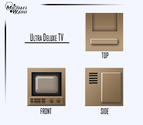
So lets put our TV together.
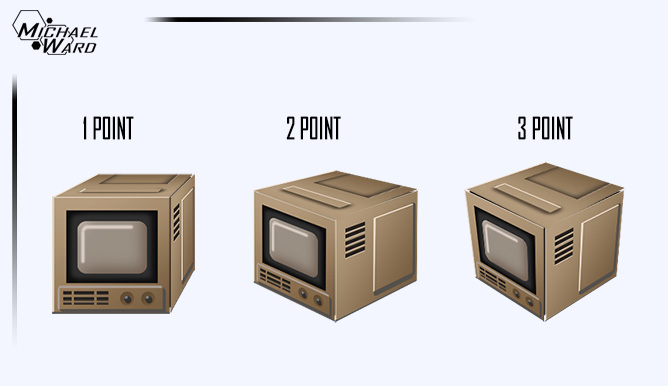 What happened? There’s 3 of them already? Yup. The same TV (cube) drawn in 1, 2 and 3 point perspective.
For the people that don’t know it’s related to where the vanishing points are:
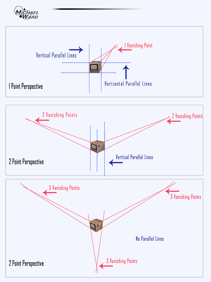 Technically the way we see in real life is 3 point perspective. But 1 and 2 point perspective are used more often in art. I’m partial to 2 point, myself. So if I like 2 point so much why don’t I just make my game using that? The issue is because objects appear smaller the closer they get to the vanishing point.
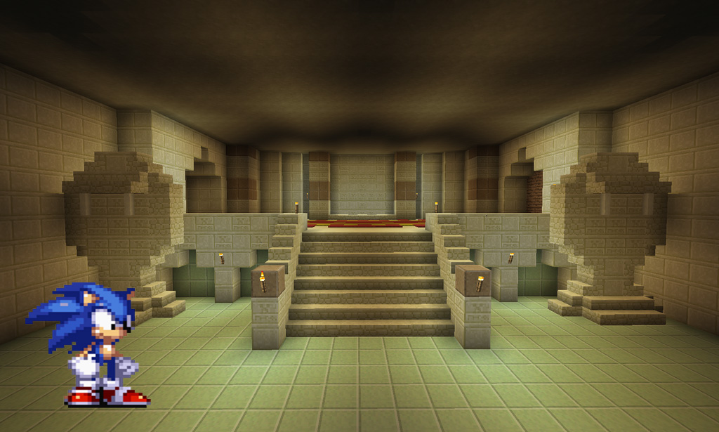
 That’s fine for all the level assets but not for the character sprite. Here’s a screenshot from Minecraft by artist Kerian-Halcyon that is in nearly perfect 1 point perspective. I put a 2D sprite of Sonic the Hedgehog to show you how he would look standing at the front. Everything seems to be ok.
 Now what if Sonic decides to walk to the back of the temple (closer to the vanishing point)? The temple blocks get smaller but Sonic, because he’s a 2-Dimensional sprite, stays the same size. This makes him appear huge!
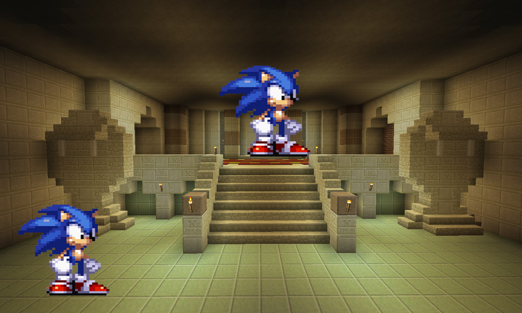 Those two are the same exact sprite and same 420px tall. For a 3D character in a 3D world we would see him get smaller but for my purposes that just doesn’t work. And yes, technically I could program the game to scale the sprite as he moves backwards but the cons outweigh the pros doing that. At least for my game.
And here is another ‘challenge’. If I make an object like, say, a sexy Ultra High Def TV and I want to put 9 of them in a line using the same sprite here’s how it will look:
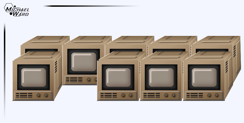 That is one fugly lineup (of gorgeous TV’s). Every TV is pointing towards different vanishing points and that’s just not right. See?
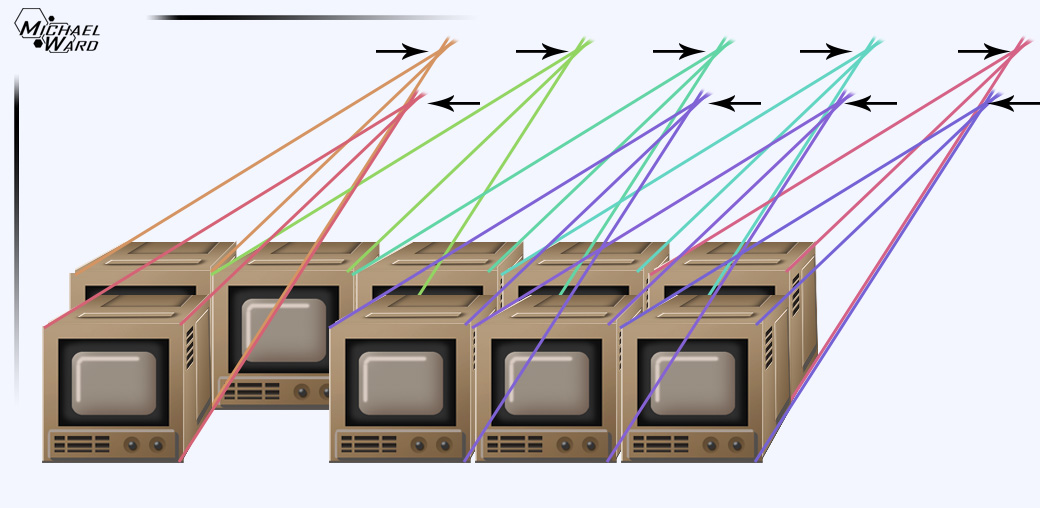 This is how it ‘should’ actually look in 1 point perspective:
 If I wanted to add this TV to my game I would need to redraw it from every different angle depending on where in the room it’s located. Neither 1, 2 or 3 point perspective will work. Now we need to start getting into Parallel Projection perspectives!
(I can’t believe this post is this long already and I haven’t even started Parallel Projection yet. I thought I’d make like 3 pictures total for this post and I’m already up to (counting 1,2….3……) 9 pictures!)
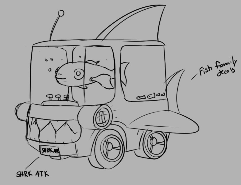
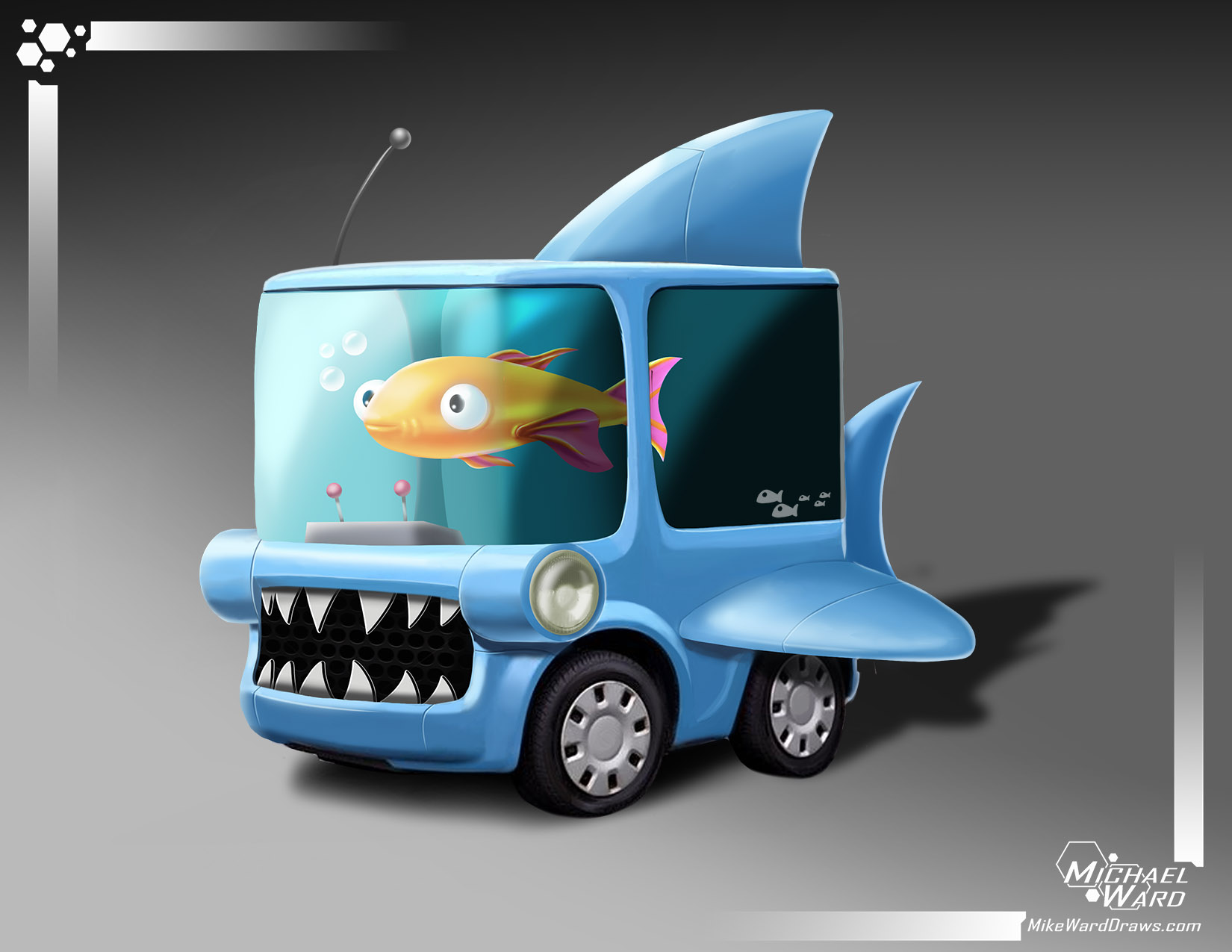
Since I’m tired of using the Sexiest TV Ever let’s try something a little more normal. Like this car!
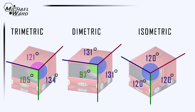
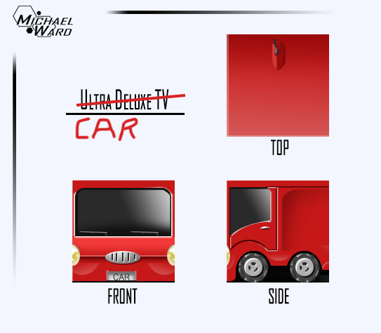 No YOU’RE the stupidest drawing you’ve ever seen. Ha. Burned. (I should mention that I’ve done everything so far with just my mouse because my tablet pen is all the way over there). And this is how they look drawn in Orthographic Trimetric, Dimetric and Isometric perspective. Collectively these are called Axonometric projections.
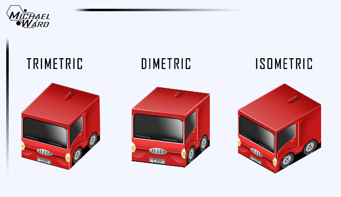 I know I know. They look the same as the first TV picture in 1st, 2nd and 3rd perspective. I told you the changes are subtle. But the impact is hoooooge (at least for what I’m doing). The difference in these pictures is that there are no vanishing points. All lines run parallel:
 “If none of the parallel perspectives have vanishing points then what makes them different?”
Excellent question, imaginary student. It’s the angles that the lines are drawn on. Trimetric has 3 different angles, dimetric has 2 and isometric has 1.
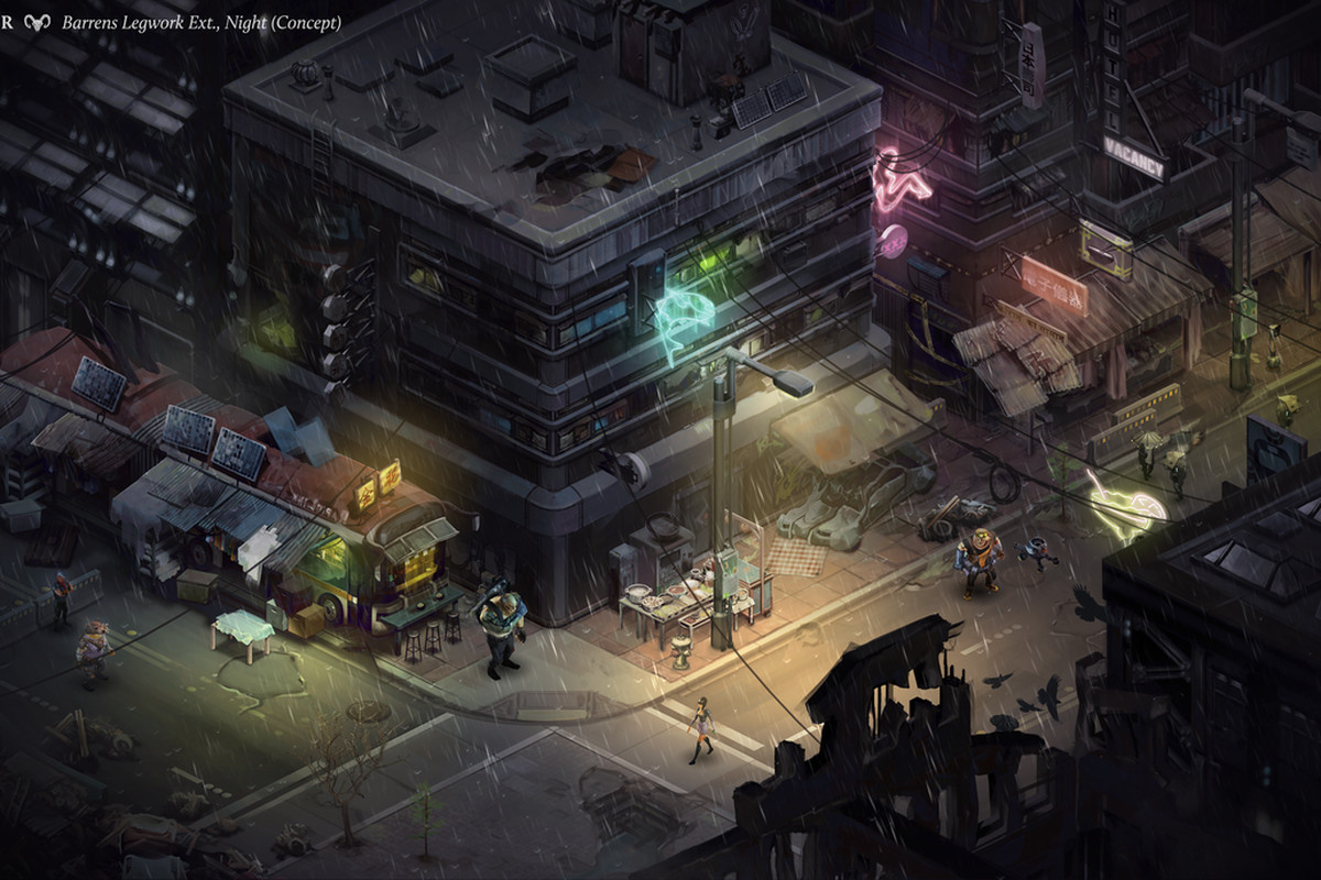
 Lots of 2D artists (especially pixel artists) will be familiar with Isometric. It’s the most common axonometric because it’s easy to understand just one angle and because it doesn’t favour any particular dimension. This is a screenshot of Shadowrun Returns done really impressively in isometric.
 Lots of theory so far. Let’s see why axonometric perspectives are effective. Look what happens when I put them in a line.
 SUPER STACKABLE! By choosing one orthographic projection I can make assets in any order and stack them together anywhere in a room and they will look ok. Which one should I choose? My favourite is Dimetric because it favours one side over the others. This would let me put more details where it matters like the front of buildings, etc. So I’m done? It’s settled?
NOPE! I’m not choosing any of these! Let’s dig deeper. (I can hear you all groaning and I don’t care. My devblog my rules. Or lord I’m up to 15 pictures already).
 Hey the TV is back. This is a very common perspective used in classic 2D RPG’s. All lines are parallel at 90 degree angles and you don’t see any of the sides. This effect is used to great effect in Stardew Valley.
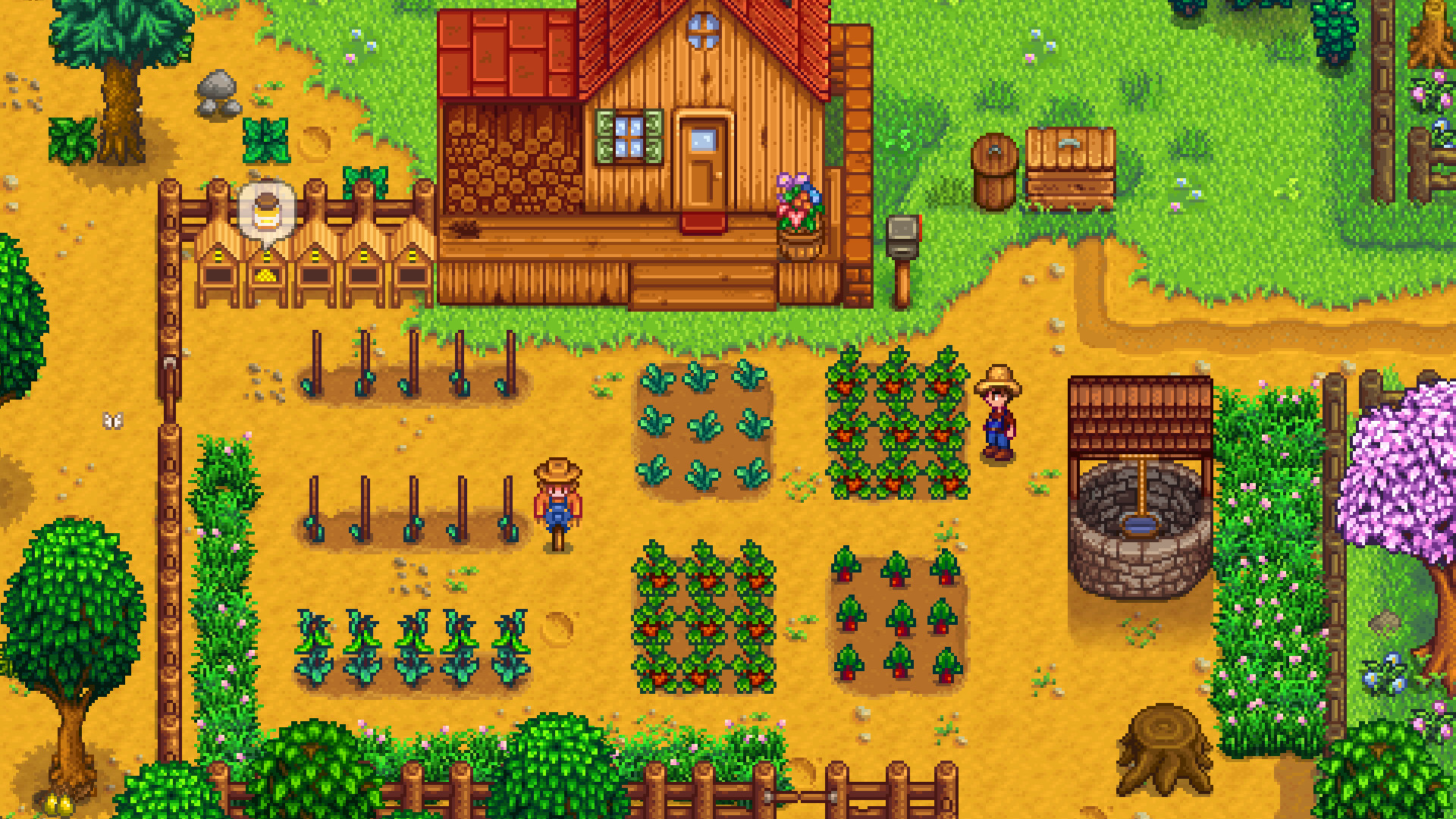 Stardew Valley is an important game in the Social Simulation and Farming RPG genres which my game will be taking quite a bit of inspiration from. And the 3/4 perspective is effective but it’s just not what I want for my game. I feel like you are looking at the word through a telescope. Being able to survey your entire farm at a glance is nice but the trade off is small details.
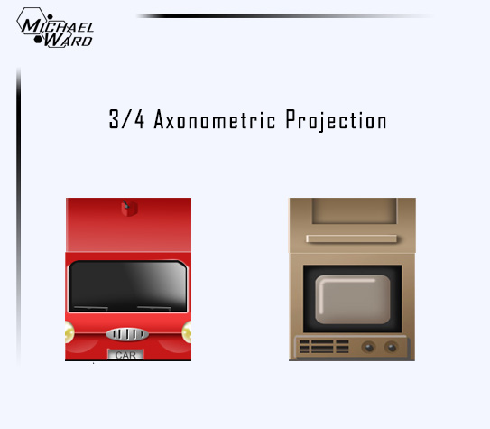
Now finally here is the perspective I’ve decided on! (Only took me two days to write this post plus 2 months of thinking about perspectives to narrow it down). Oblique Projection.
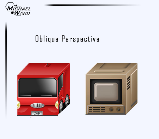 Also called Cabinet Perspective because it’s often used in cabinet schematic drawings. Here are the benefits.
- You see 3 sides (more details)
- No vanishing point means they can be stacked and moved anywhere.
- You see 100% of the front side without any distortion. The front of the car and TV is facing us completely as a perfect square.
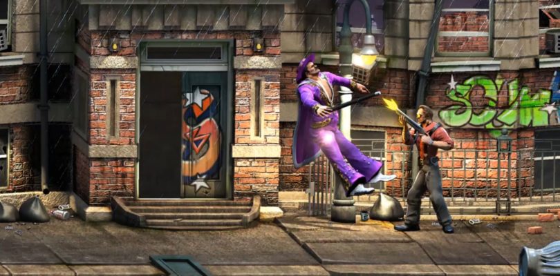
The whole point of making my own game is really to flex my artistic muscles. Learning programing/design/writing/publishing/PR/etc is just a side effect. I’m all about the art. Upcoming Beat-Em-Up Raging Justice is done in this perspective and just look at these graphics. So many graphics.
 It’s a common perspective used in Brawler games and I thought about trying it for my game a few days ago. But I wasn’t completely sure it would be viable. Brawlers let you walk left, right, up and down but you really don’t go that far into the background. But I found a game that actually used oblique projection really well. A really old game. Earthbound!
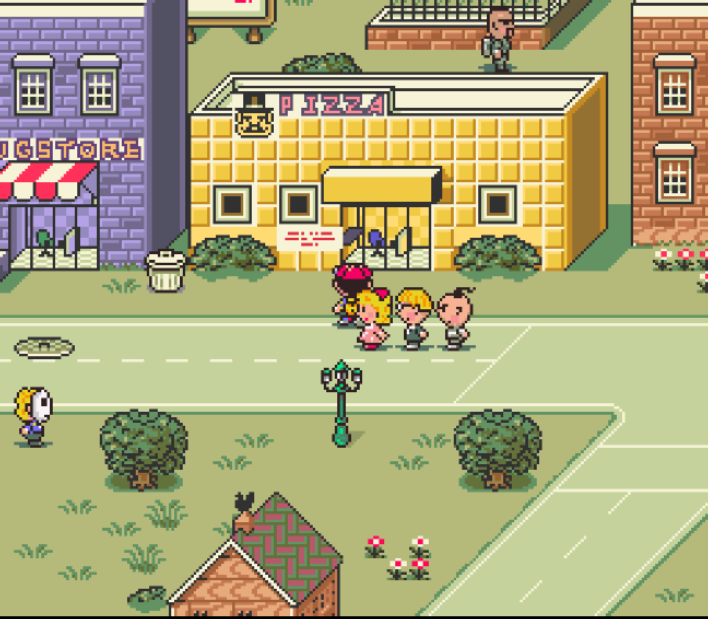 You don’t even know how excited I was to find out such a beloved game used this perspective so successfully. Just imagine that game with the graphics of Raging Justice. That’s my goal. is it doable? Hahahaha. HAHAHAHA. I don’t know. Maybe?
So there you have it. But before you go let me show you an easy photoshop trick to fake your way into drawing something in 3D using flat 2D pictures and the Transform > Distort tool.
 I know this whole post was completely unnecessary for me to say “Hey guys I’m gonna make my game in oblique perspective”. That isn’t even a whole tweet. And I don’t know who I’m trying to teach with all this. But one day I could be an art teacher or do a GDC talk so it’s good practice. Maybe it’ll actually help somebody??
Also there are other perspective projections I didn’t cover. You can read these two articles if you want to know more about game perspectives. Here and Here.
Love Michael