(Last post tonight)
This post is the one I’ve been most looking forward to writing tonight. This is about the image I’m the most proud of ever. Not just during my time in art school.
The assignment was to create a prop. Any prop at all. Big or small or soft or hard or complex or simple. Anything that wasn’t a character, animal, vehicle or weapon, basically.
And just like the rest of the summer; I was way behind on my assignments. I was going to go simple. I failed spectacularly at that. I tasked myself with creating a Clockwork Globe. A planetary globe of Earth that is controlled by gears that would change the plates to show how the continents changed over millennia.
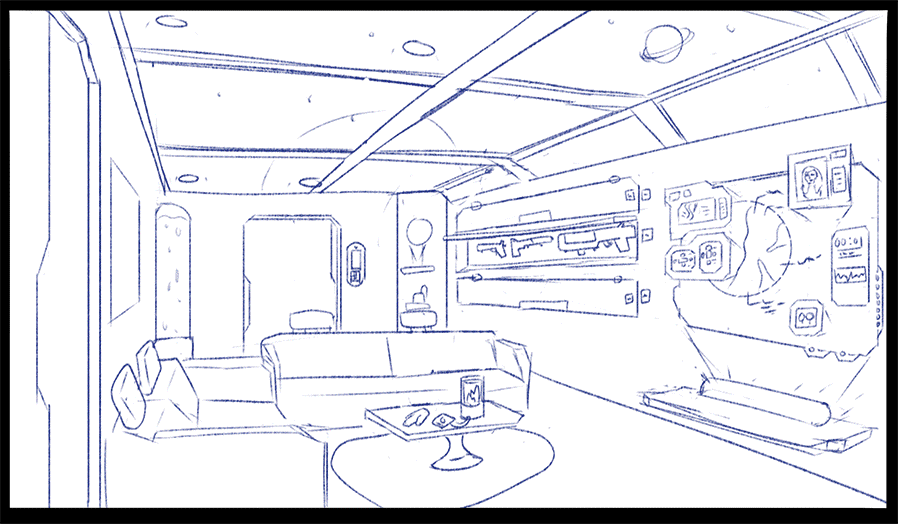
During the thumbnailing stage I didn’t realize how complex this idea is:
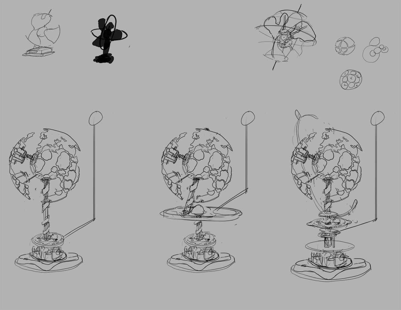 Just a few gears and poles poking about but mostly just flat or round smooth surfaces.
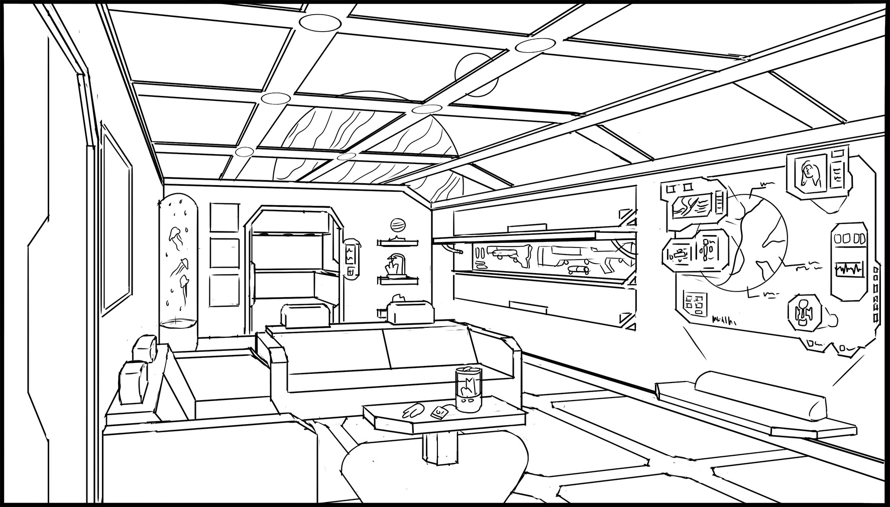
During the line art I started to figure out how dumb I was:
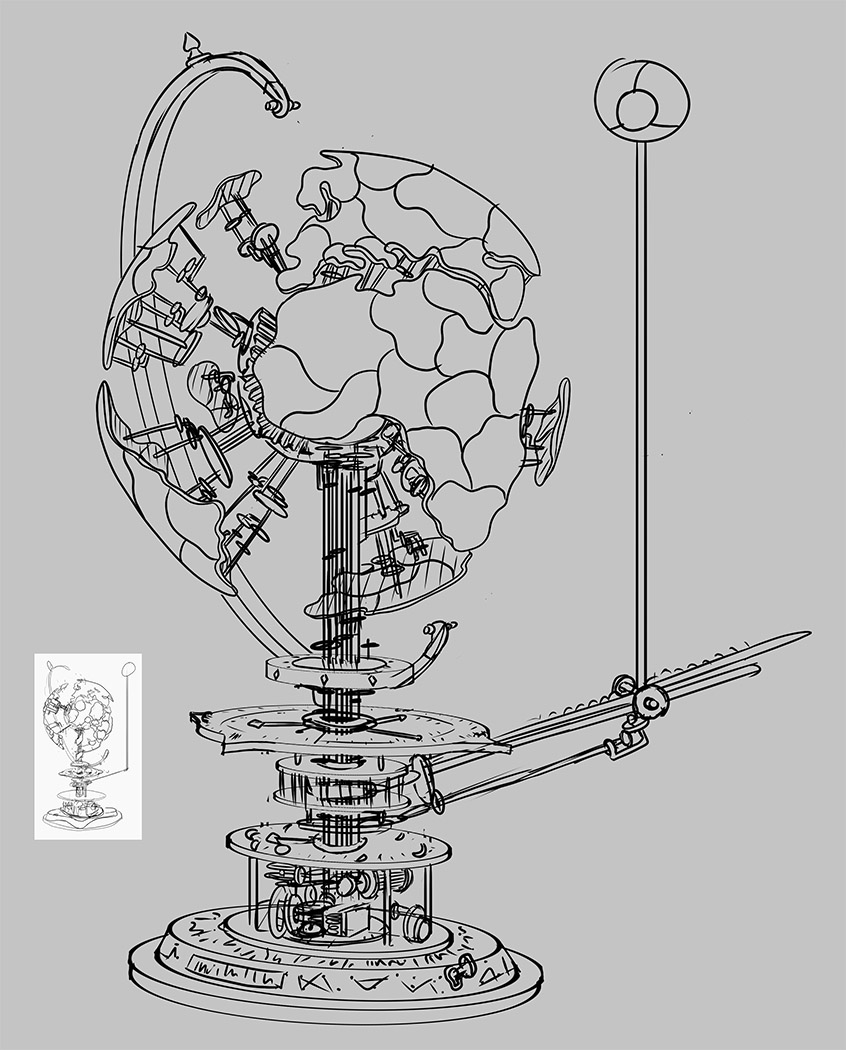 I really struggled with the perspective at first and I started over 10+ times. I know for concept art it doesn’t need to be 100% perfect but I wanted this to be done right. Even though I was so late on my assignments and I was currently working 10-12 hour days I just wanted to make this image.
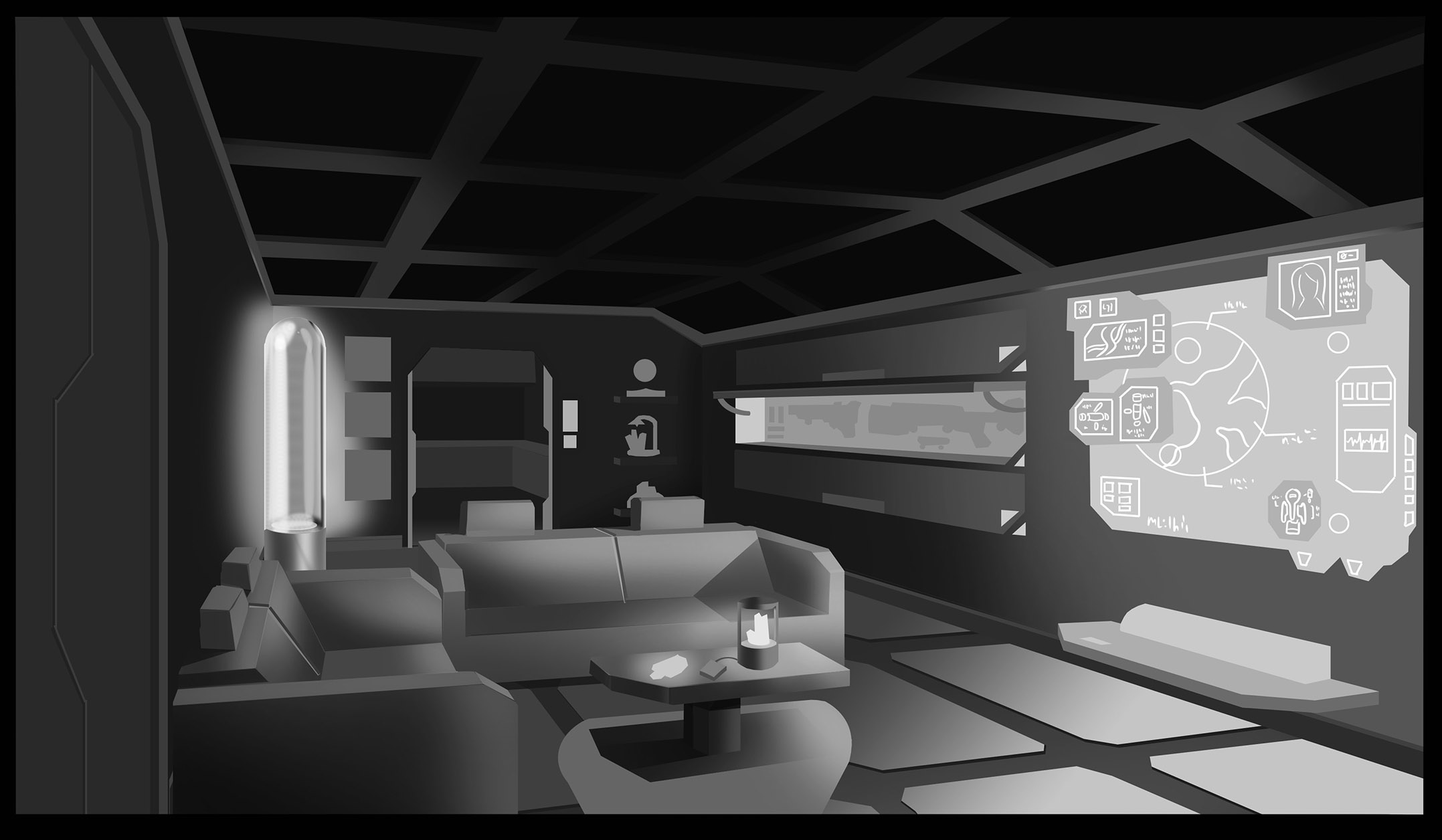
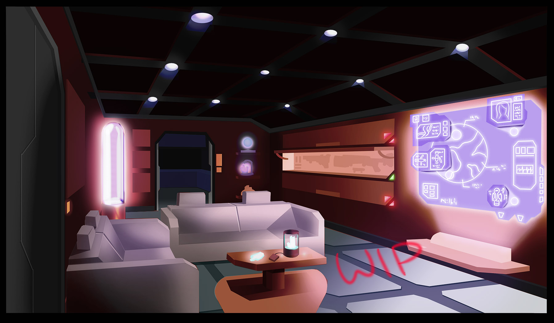
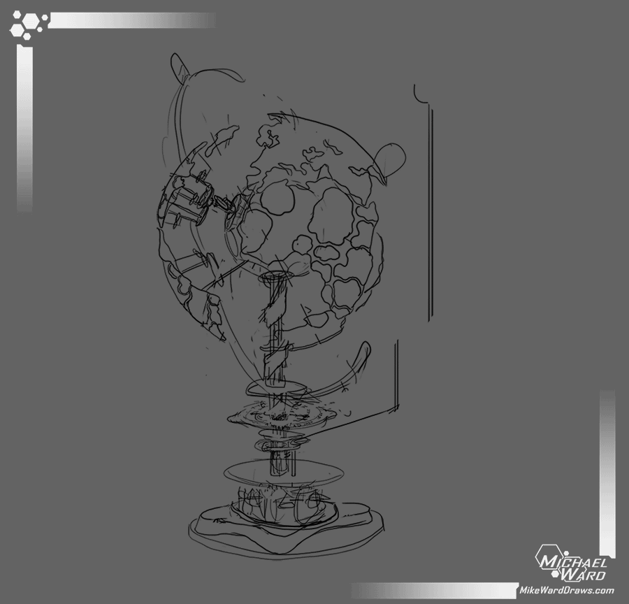
And this is the finished image.
 I was so late with this image that I had to simplify so much from the line art. The gears at the bottom aren’t nearly as complex as I imagined. The engraving on the wood isn’t there. But I am so happy with this. There are flaws and missed opportunities but so many times while drawing this I started sketching simpler props. I gave up completely on this picture every single night only to wake up ready to fight it more each morning.
And for fun here it is animated:
 For my next assignment I WILL go simpler.
Michael