Lesson 9: Character Design and Anatomy

Hi Diary,

I’ll make this a short post since it’s gone midnight and I should be working on this weeks homework.

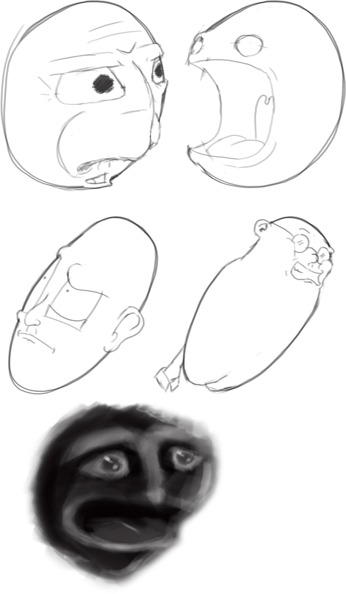
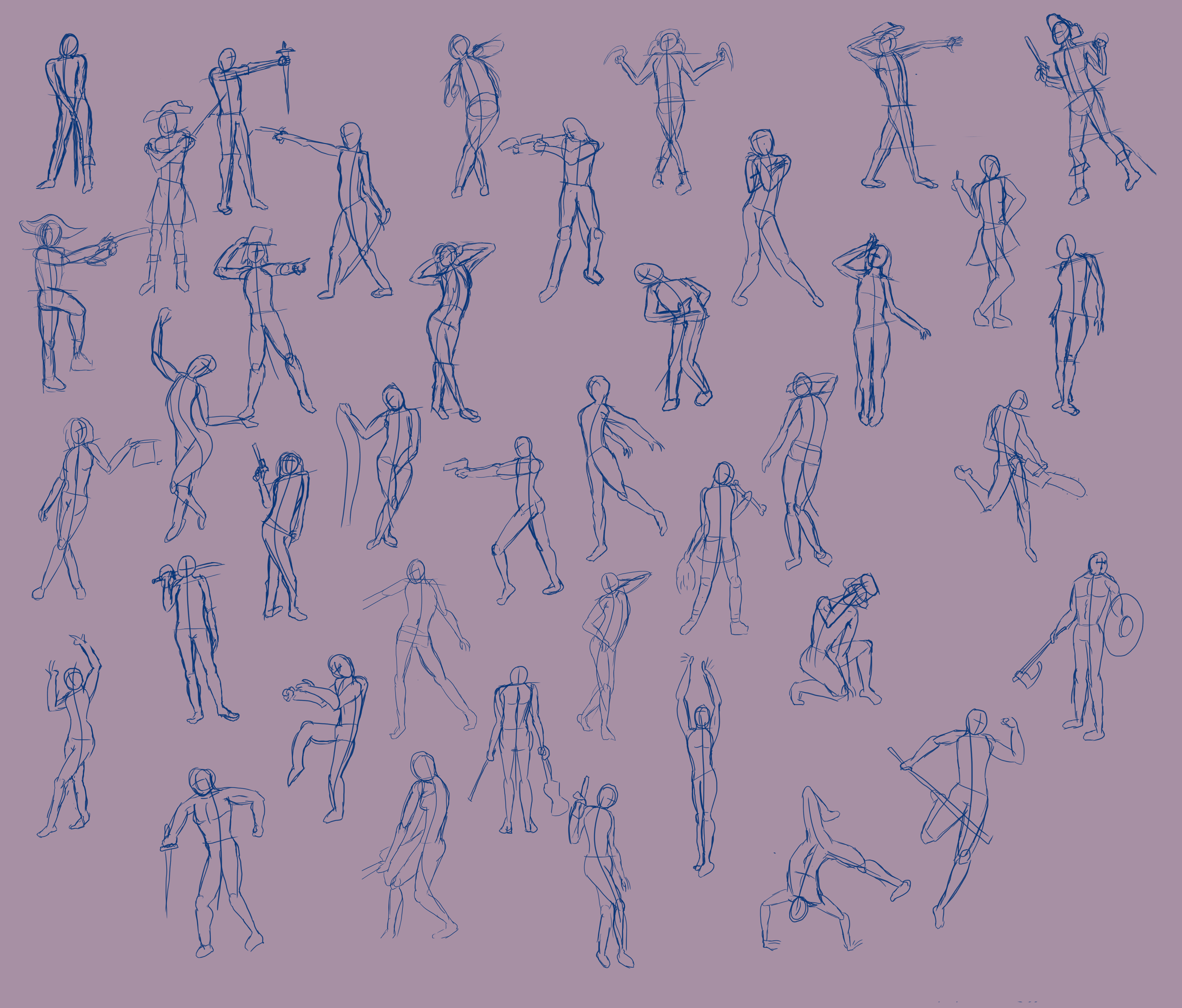
So last week we learned about character design by manipulating anatomy. The anatomy still had to be accurate as far as muscle structures go but the goal was to stretch or squash or build up or slim down various parts to make a unique character. I’ll tell you now, I did not do well at this assignment.

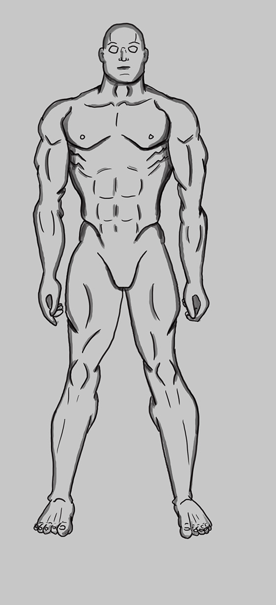
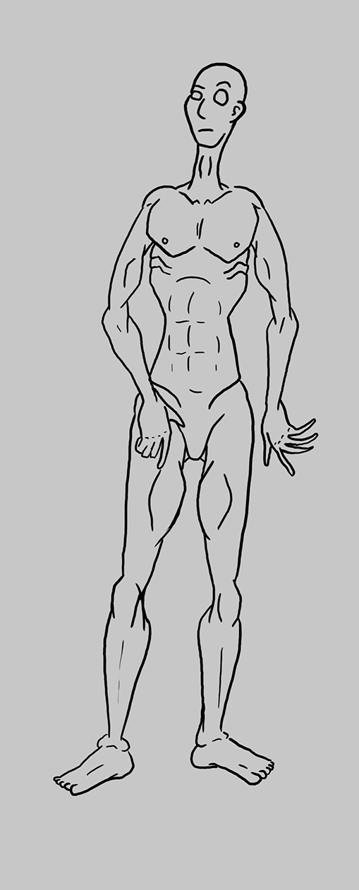
First the three ‘normal’ characters.

figure1figure2figure3

First of all, drawing girls is hard. The first one I drew had all the muscle groups (as I understood them) bulging out like on the guy. It did not seem feminine. Which is weird, right? Girls have muscles. My wife is in way better shape than I am and she looks crazy feminine. I’ll have to practice that more.

Anyway! The anatomy on both the men’s shoulders and the muscle mans legs are way off. I made the mistake of using a “How to draw superheroes guide” while doing them. Tom, my teacher, advises against that because it’s “reinterpreting someone elses reinterpretation of anatomy” and he’s exactly right. Now I’m using actual photographs for reference.

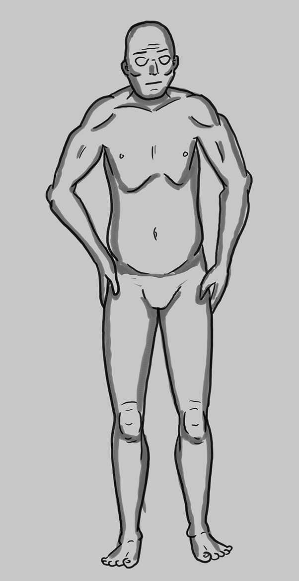
Now the manipulated ones!

figure4 figure5 figure6

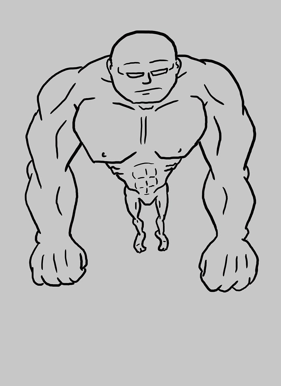
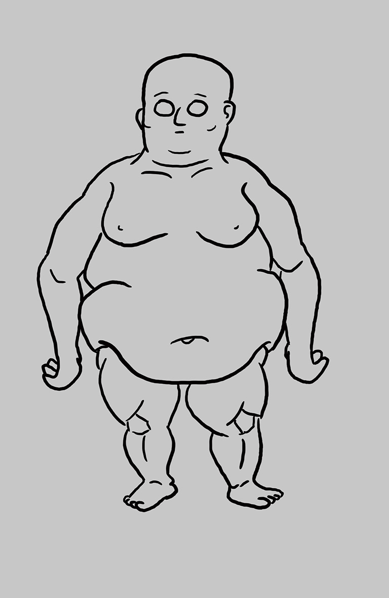
Tom said he actually liked the huge muscle guy which is cool but major issues with the biceps and shoulders. For one thing, I thought the biceps were like a big square muscle where the boobs go. Nope. More of a triangle but it appears square because of the shoulder anatomy overtop. And I would know that if I used real life references instead of drawings! Arg I’m so mad at myself. The skinny guy has too many issues to even get into. And the fat guy has girl boobs. Did you know that mens fat looks different than girls fat on the chest? Yup. Sorta wraps around. Blegh.

Overall I got 72% on the assignment. (There was more stuff with volume and 3D boxes tumbling through space. Boring stuff even for the blog but I did well on that). But 72% is my lowest mark yet. I’m not letting it get me down. The next blog post will explain what I’m doing to fix this.

Love Michael


Art School Lesson 8

‘Sup Diary,

So. Week 8. That was a fun week actually. It was all about skulls, hands and feet. I’m not good at skulls, hands or feet. I tried to really ace this assignment. I spent hours and hours (usually in the middle of the night) on each part. First the skulls:

skullsCool, right? I even rendered them. There are a lot of little errors and mistakes across the board but for the most part I’m pretty dang pleased with myself. This seemed like a daunting task when I started and now I feel like I could do it again in half the time.

The hands:

handsSorry about the dark backgrounds all the time. I drawing directly on white. It’s so harsh on the eyes. Especially since most of my drawing is done at 2am after the baby has gone to sleep. Anyway you can see they are a little rough. I have a problem with drawing 3 or more lines for each line. Some people choose to draw that way because it gives the image texture and depth. It can be a good way to show implied shadow as well. But for a concept artist its a bad habit. If a 3D modeler was to render an image I drew, he has to be completely certain where the line is.

I did a little bit better on the feet:

feet

Look how clean those are. The feet were easily the fastest part of the assignment. My teacher, Tom Jung (I’ll make a post specifically about him and how he teaches the class soon), says feet for him are the hardest. You wouldn’t know it though because I specifically used his technique to draw it. He said “Draw a wedge and then a block and make it a foot” and really really simplified it. And that’s exactly what I did. Good job, Tom. That’s some dang good teaching.

Overall I got 80% on the assignment. I really hoped to get more since I put so much effort into it. I’ve gotten higher marks for other classes that took a fraction of the time. But for the faces it’s clear I had some issues with perspective so I can’t argue that it needs work. I’ve yet to get a 90% mark so that’s my current goal. I’m doing Week 10’s assignment now. Perhaps this is my week?!

Luff Michael

Art School Lessons 1-7

Good morning Diary,

In an effort to catch up to where I am in school this post is about the first 7 lessons of my schooling. Just the finished assignments. After this post I can start getting into more detail with future posts. Art school is like any other school anyway. The first few assignments are super easy and not that interesting to look at.

Week 1:

pg1pg2pg3

Yup. Lines and ellipses. Pretty exciting stuff. But the last page was kind of neat. I had to draw a round shape and then copy it over. Then I made faces out of them. You’ll notice the first two and the second two start with the exact same oval shapes. (Ignore the last face. It was an experiment with the brushes).

Week 2:

001 002-2 003

Shapes in perspective! Awww yeah. You’ll notice they don’t look quite right in some of them. If you’re like me and you draw a cube first to draw a cone or cylinder it’s very important that IT’S ACTUALLY A CUBE! Ugh. I suck.

Week 3:

1point 2point 3point

Shaded shapes in perspective! Those are some fine looking shapes, right? I was supposed to use the shapes I did in week 2 but they were so wonky that I chose to start over. Also look at those shadows! Those are mathematically derived perfect shadows. I really liked this lesson.

Week 4:

citynolines

Here we go. Now we are cookin’. I had to do a street scene. Any street scene. I chose a western street.

Week 5:

refinishedIt’s the same street scene! Only it’s way nicer. I lost some marks on my ellipses like on the barrel or water tower. That continues to be an issue for me. Seems every week I get an ellipse wrong somewhere.

Week 6:

figures1 figures2 figures3

Oh, I forgot to mention. There may be nudities in this blog. So like… don’t look at the pictures you just looked at if you don’t like anatomy. I gave you fair warning. (Just kidding. It wasn’t fair)

Week 7:

gesturesblogGestures. Ugh. These are not good actually. This assignment was done about a month ago (at the time of writing this) and now I’m actually starting over. You’ll see another post soon about all the gesture drawings I did last night. Not for school. Just because I really really REALLY (really) need to learn it better.

Ok so we got all that out of the way. The posts after this will get much more in depth into each lesson.

Love Michael

Scholarship Portfolio

Dear Diary,

Two posts in one day?! You lucky guys. I’m trying to catch up to the current assignments with school but I don’t want to miss any so I’m rushing through the first 8 assignments (currently on 9…duh).

BUT this is about the portfolio I submitted when I applied for the scholarship at the school. It’s not many images. Scroll past them to learn if I was successful.

butterflycreature3exteriorinteriorthreeshipsfemale1fox

I failed! That was the outcome. Yup. No scholarships. But that’s ok. I knew going in that there is a lot I don’t know and that it would be a stretch. I’m glad I tried so I don’t have to wonder.

And yes, the spaceships are from my Fuzzy Outlaws comic. What of it? I like them. Lemme ‘lone.

Lurve Michael

Concept Art Intro Class

Dear Diary,

As I said in the previous post, I am going to start posting all my assignments and adventures with the Vancouver Animation School concept art program. (I added a link to the school at the top of the website).

But first I’ll start with the concept art intro class that I took back in January. The school offers intro classes that last a month (4 lessons) to see if you like the school or can even keep up with the assignments. I loved every second of it. Before I even finished the course I was already signing up for the diploma class.

My teacher was Adrian Enciso and he was very good. A tough marker but he explained all your wins and fails very clearly. I always knew after where I went wrong. Here are the finished assignments:

Week 1:

posespgallWeek 2:

silhouettesWeek 3:

foxWeek 4:

landscape2smallYou can see detailed posts about all these assignments at my comic site www.fuzzyoutlaws.com (I didn’t have mikewarddraws back then).

The old posts said my final mark was 76% but it was actually increased to 84%. I’m not sure why they images were remarked but I didn’t mind the extra percents at all.

Love Michael

Portal Website

Finally a new website to link to everything that I do! I’ve been threatening to make one of these for 6 years.

This site will link to everything I do on the internet. I’m trying to both increase my web presence as well as connect it all. I created all the new accounts on tumblr, instagram, etc with the MIKEWARDDRAWS name and this website links to all of them but so far they are empty. They will all independently host the same images so if you follow me on one you will see most of the images/concept art/comics I make.

Animations (of which I only just started dabbling in) will be on Vine and Youtube. Youtube will also (one day) have drawing videos. It’s all a process.

More links will be added in time as well as an ABOUT page and official portfolio. Naturally I don’t want every doodle or silly comic in my portfolio so I will keep the best-of-the-best there.

MOST IMPORTANTLY: This blog will document my struggles through art school from sketches to concept artist. I’m currently in my first term of the Concept Art Diploma Program at the Vancouver Animation School.

I won’t post every little thing because I want to encourage people to sign up with the school but you’ll see lots of WIP’s and finished assignments. I will also post some critiques I got and explain why I lost or gained marks. I’m 8 assignments into the program now so I’ll quickly post how the previous weeks went on the site shortly.

That’s long enough but I always like blog posts with pictures so:

tapdancingAww yeah. Website is off to a good start.

Love Michael